Thinking in Svelte
- Data Visualisation
Svelte framework, to me, is a magical toolbox. It lets you break down interactive web pages into tiny pieces — so called components — that can be combined to create complex UIs.
A component is a self-contained unit, with its own HTML, CSS, and JavaScript. Writing Svelte feels like building with LEGO blocks – you can mix and match components to create a larger piece of work. Plus, it makes programming way easier because you're not wrestling with one gigantic complex mess of code; instead, you've got these manageable little chunks that you can work with. So, it's like having a secret spell for making awesome interactive pieces quickly & efficiently.
In this piece, I will walkthrough my process for creating an interactive dot-dash scatterplot visualising international travel data. I will take you through a step by step process of going from the data to the final visual.
Starting with the Data
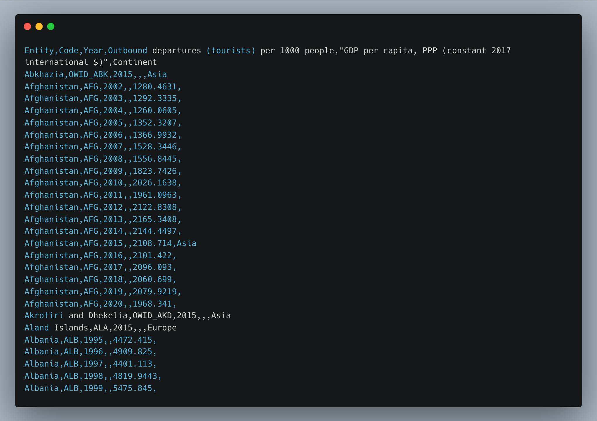
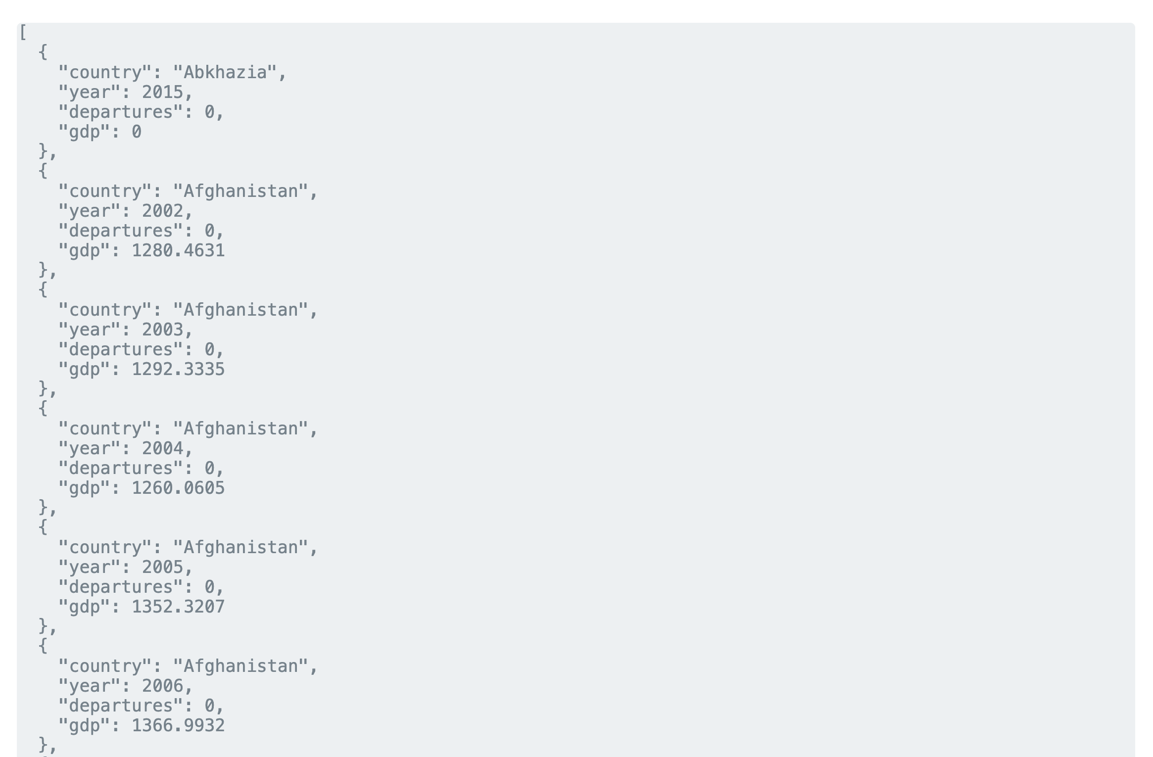
I downloaded CSV data for tourist departures from Our World in Data and used D3’s CSV parser to clean, parse, and convert it to a more convenient JSON format.
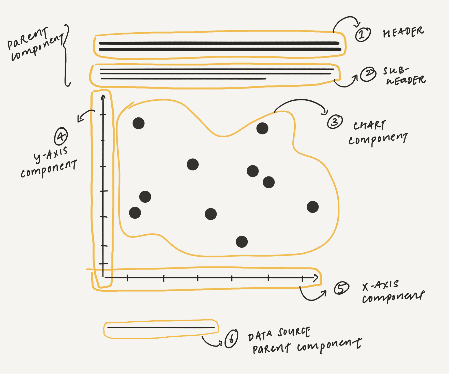
Decomposing the UI
Next, I sketched out the UI & began breaking it down into individual components, naming them, and identifying their hierarchy. There are multiple ways of breaking down a UI based on personal preference & how reusable each component needs to be. A good rule of thumb is to keep the component hierarchy simple to begin with & break it down further if the need arises.
Identifying Data, Derived Values & State
There are different kinds of information that are used to build an interface — data, constants, state variables, and derived values. Similar to the component hierarchy, there is a hierarchy of information that gets passed from one component to another. It helps to identify these connections & assigning them to the respective components responsible for managing that piece of information.
Working Alongside D3
D3 works in a way that is very complimentary to Svelte’s component model. Instead of using D3 selections & data binding to keep track of changes, Svelte’s reactive variables and declarative templates make rendering less cumbersome. A good separation to keep in mind is to use D3 for all data transformations & Svelte exclusively for rendering.
Working in Small Iterations
One of the real turning points in my journey to learning Svelte is understanding the need for working in small iterations, checking & building confidence as I go along. Unlike the popular legend in movies, no programmer types away hundreds of lines of code, presses enter & voila everything just clicks together! Building the discipline of breaking down large changes into tiny steps really helps make sure the code does not get out of hand.
One other lovely aspects of working with Svelte is that it automatically updates the UI on saving a change, all without requiring a browser refresh or losing the component state. This makes the development feel fluid, every time I create or modify a component, I systematically test it on the browser to ensure that it works as intended without introducing any errors.
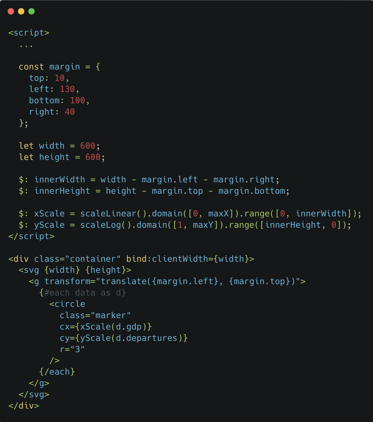
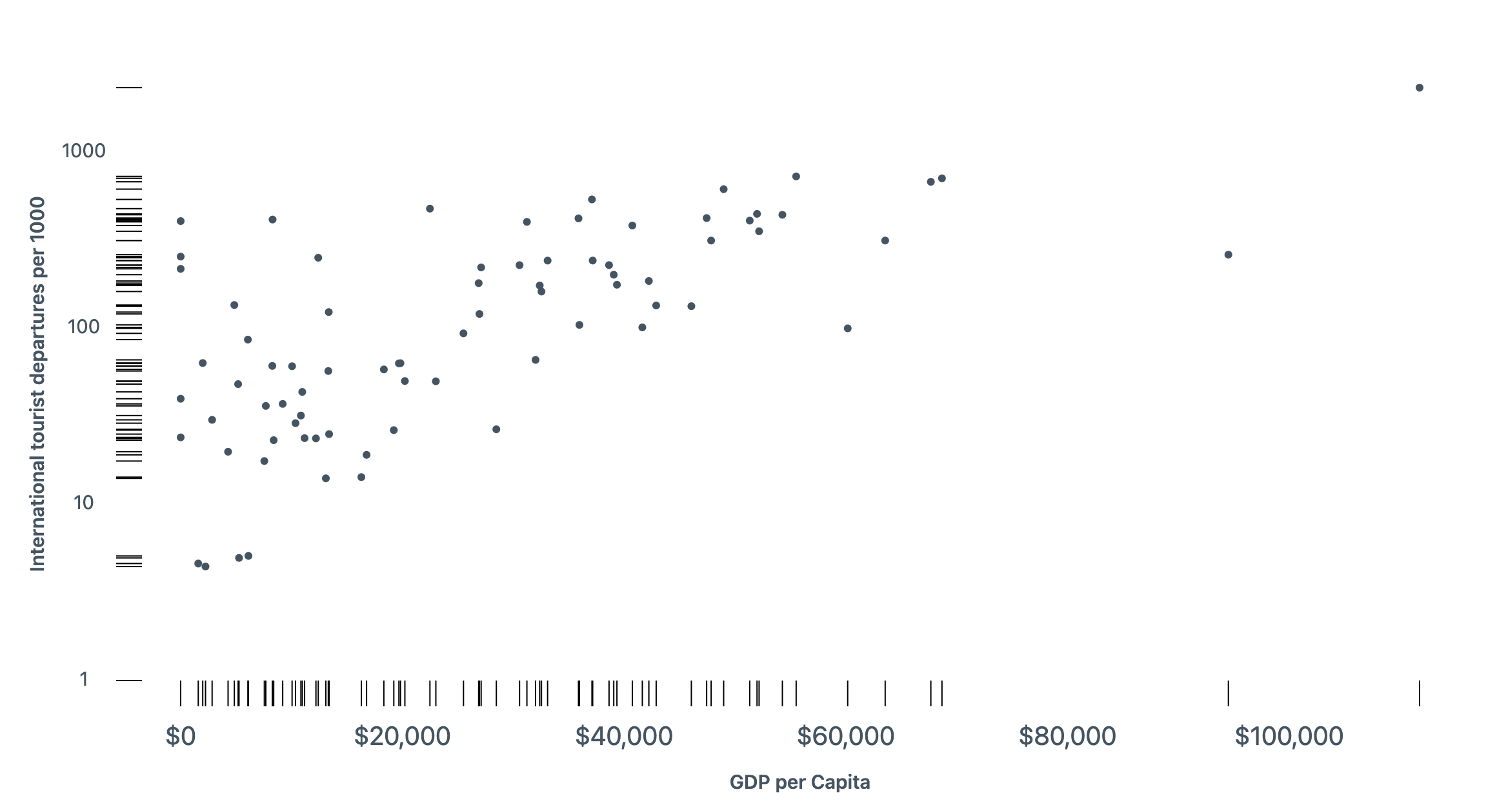
Iteration: drawing markers & axes
The next step was to render the dash markers. I broke it down into 2 components, one for each axis, grouping the markers, labels & axis titles into their respective units.
Iteration: adding responsive behaviour
Now that I had my chart & axes in place, next, I took a look at making the chart responsive. The bind:clientWidth directive in Svelte makes it simple to measure container width & use it to scale the chart to the viewport size.
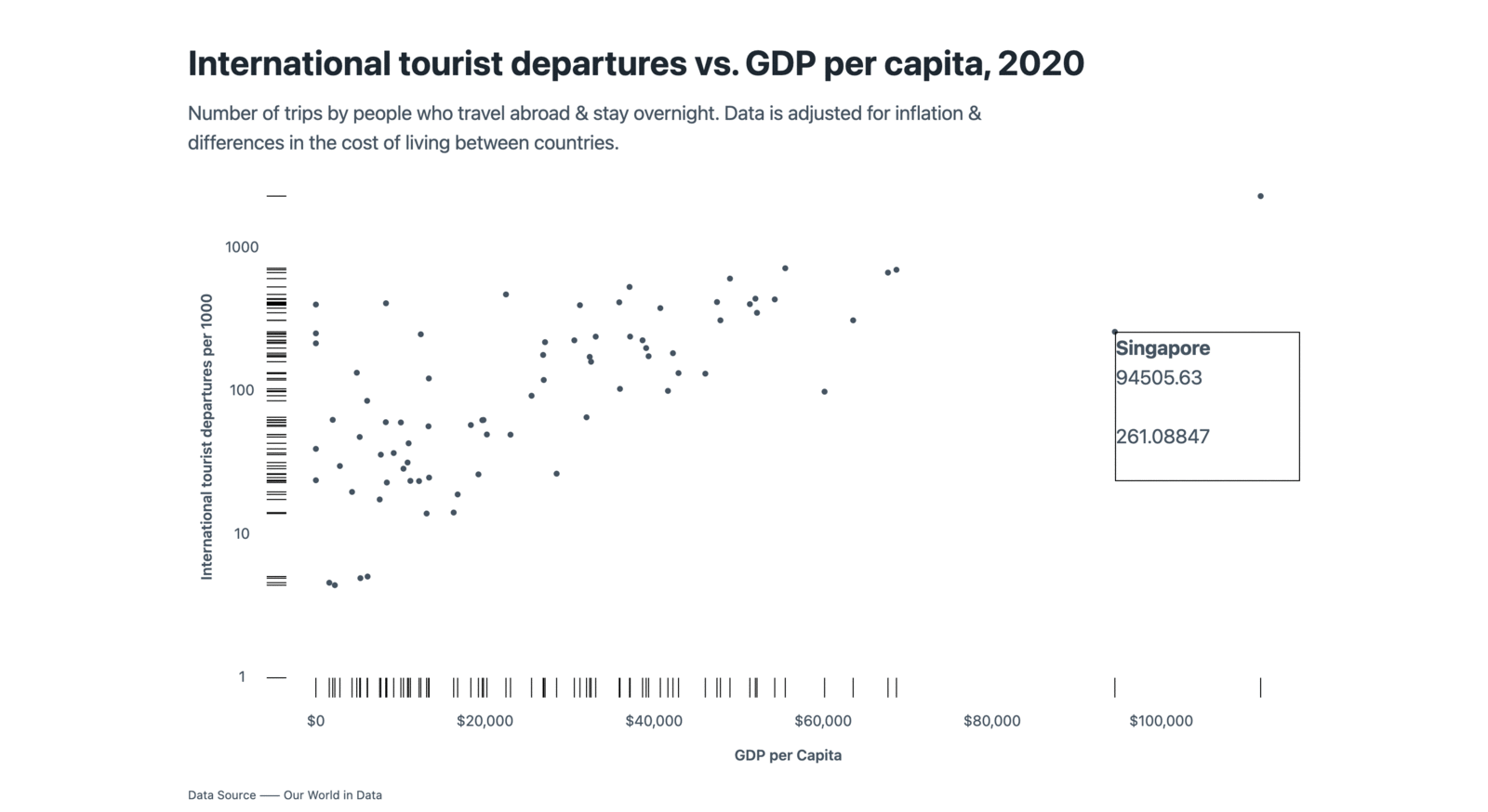
Iteration: showing a tooltip
For the tooltip, I started by simply displaying the data on mouse hover & once I had that working, I moved on to styling it & handling edge cases when hovering over the sides of the chart.
Iteration: introducing a range slider
I added an input slider field to allow users to see the change in data over
the years. Again, Svelte makes this easy to implement with two-way data
binding using the bind directive. Watching the data change showed
a general trend which gave me an idea for the next iteration.
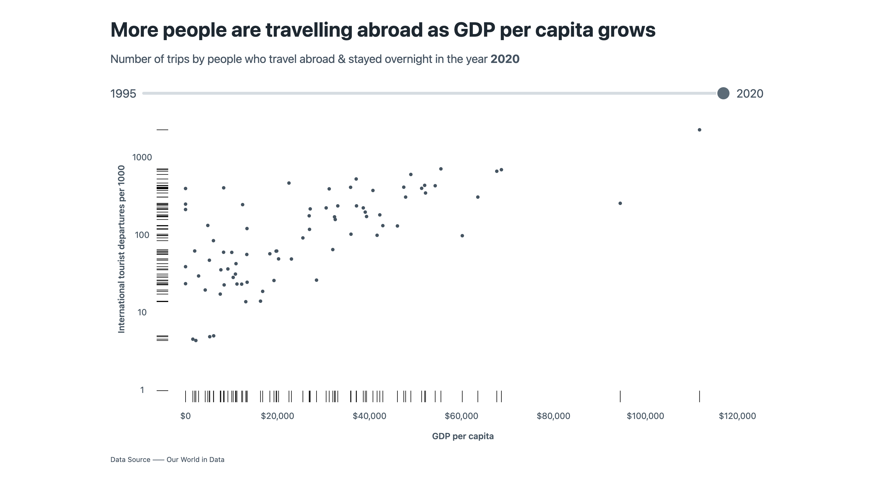
Iteration: playing through the years
I added a play-pause button to allow the reader to more conveniently see the
trend over the years. Svelte makes adding little interactions like these quick
– just increment the selectedYear state at a regular interval & everything
else recalculates & adapts to show the correct data.
Accessibility Considerations
Apart from making sure that the UI is responsive & adapts to different screen sizes, it has been beneficial to focus on refinement & incorporate features that support accessibility. For example, I expanded the target area around the data circles to make it easier to point at them with a mouse without hunting & pecking.
To improve usability for keyboard users, I sorted the data along the x-axis & added prominent outlines for tabbing through.
As a designer often using design tools, it is easy to overlook some of these details without the concrete feedback that working with code provides. While iterations are much slower, the depth & comprehension that it builds is unparalleled.
Here are the key things that really made a difference for me:
- Taking the time to truly understand & practice the fundamentals.
- Embracing the incremental approach of breaking down large problems into bite-sized, manageable pieces, and tackling them one step at a time.
- Treating my code with the same level of care & attention as I do with visual design.
- Exercising discipline & staying committed to regular practice.