Come, Let’s Take a (Data) Selfie
Collecting audience insights at UX India 2019
- Data Physicalisation

Intent
Block print in a physical data art installation that aims to collect and reveal patterns about self-reported characteristics of an audience through a fun, engaging exercise.
Data Collection
Block print in a physical data art installation that aims to collect and reveal patterns about self-reported characteristics of an audience through a fun, engaging exercise.
Visual Encoding

Iconography
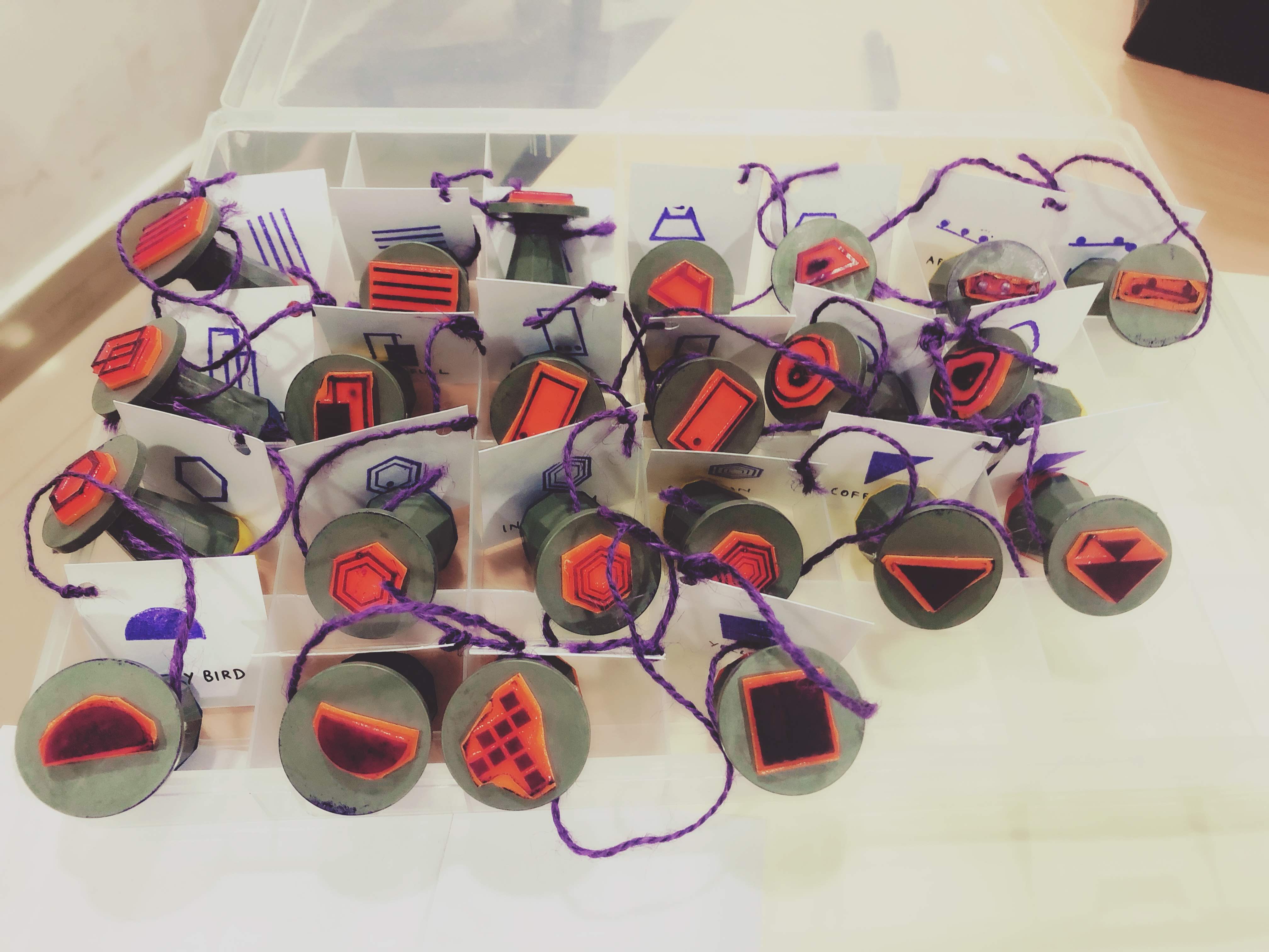
The custom stamps were designed to be as intuitive and iconic as possible. For instance, to distinguish iOS and Android phones, a simple phone icon was designed with a single home button to represent iOS and three home buttons to represent Android.
Color
The first question asked to the audience was designed to bucket them into two categories, people who enjoy company or people who prefer their own corner. The color of the stamp pads used by the audience was decided based on the answer to this question.
Tags
Given the large number of stamps, we found it useful to attach tags to each each stamp clearly indication its icon to help the audience find and use the stamps corresponding to their choice.
The Canvas
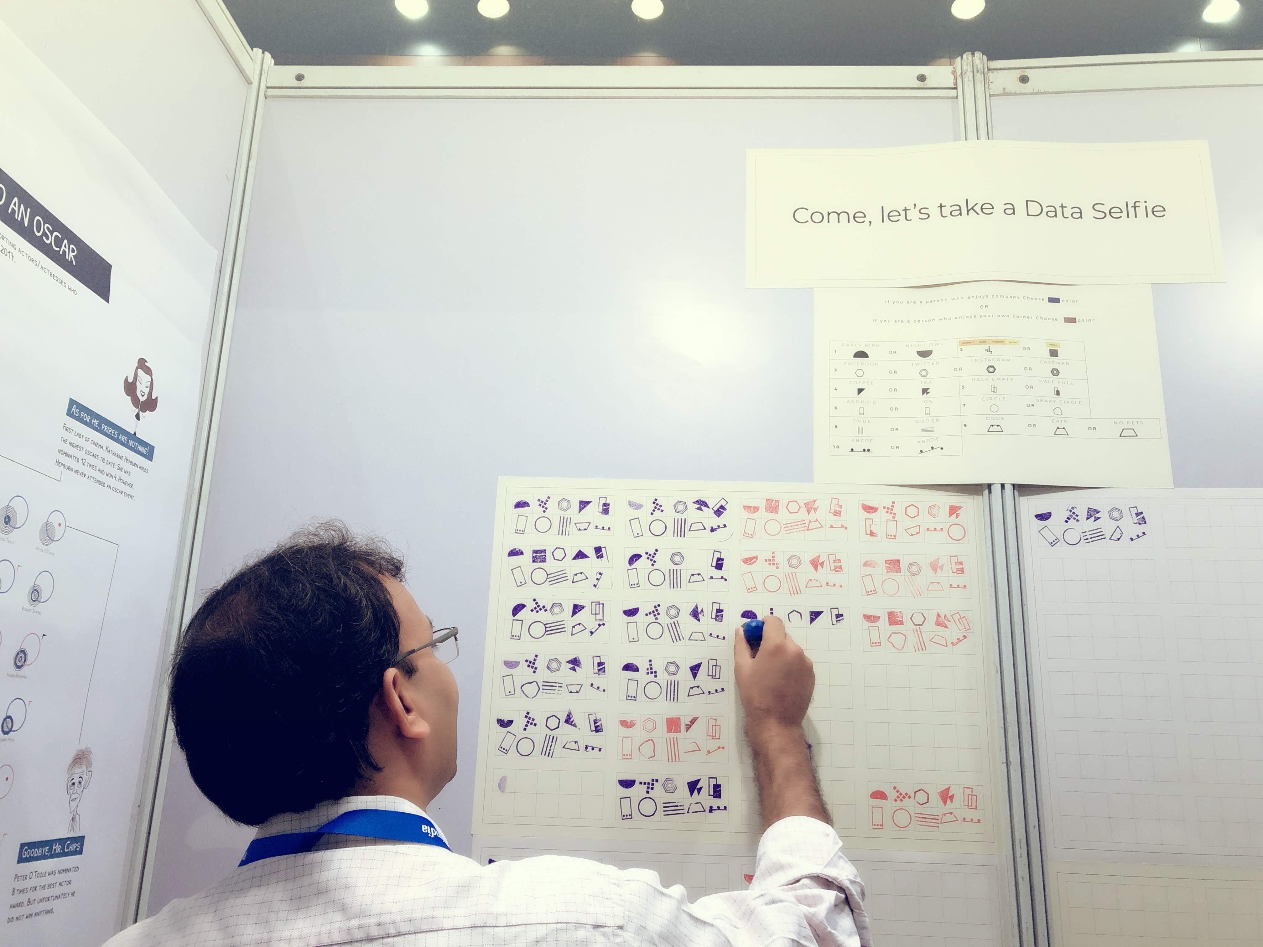
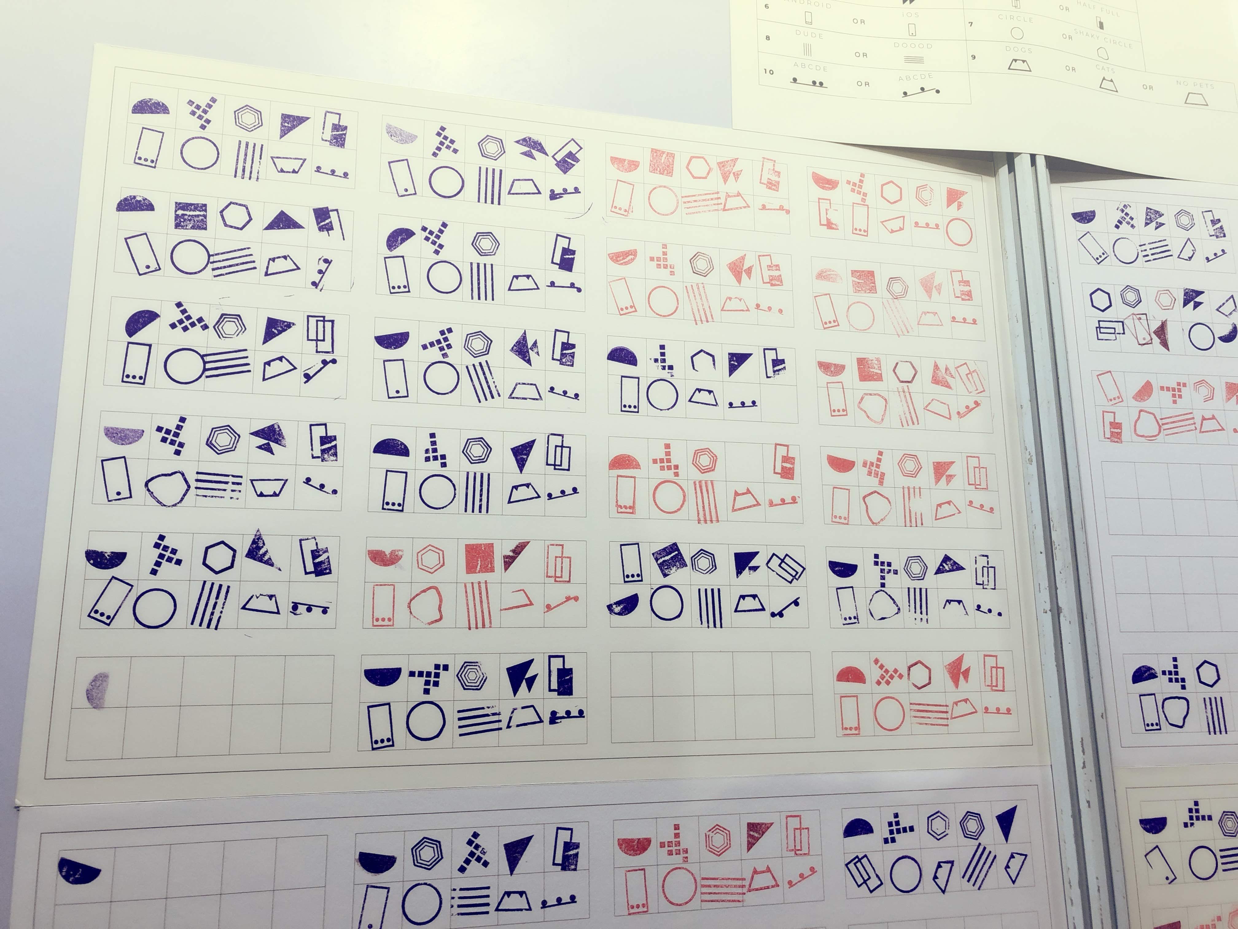
A large canvas was installed along with instructions, the answer stamps and stamp pads. The canvas was sectioned into grids for use by the audience. One grid consisted of 10 cells, one for each question. As the audience went through the questions, they picked up the stamps corresponding to their answers and left their imprint on the corresponding cell.
Learnings from the Data
As the answers were collected, the canvas evolved into a portrait representing the diverse personality of the audience. While the final piece qualifies as data art, it also provides us a picture with common patterns depicting the audience.


Learnings from the Experience
Some members of the audience observed that, this may be a good exercise to collect data during user experience research. Particularly, the use of a collective physical space to engage an audience would be more effective than rote form filling.
Design Learnings
Some members of the audience had difficulty in establishing a reading order in the instructions. Some read the questions left to right, while others read them top to bottom. It would be better next time to improve the readability of the instructions and establish a consistent format between the questions and the answer grid.
Some members skipped through the instructions and jump straight into stamping. A manual intervention was necessary from our side to ensure the audience fully comprehended the process. It would be valuable to condense the instructions to encourage more people to read it before starting.
Even though the stamps were tagged and organized, the audience was not sufficiently incentivised to place the stamps back in their respective slots. Perhaps, this could be made an explicit part of the process or explore a different arrangement (such as hanging the stamps) which would minimise the chaos.
The stamps themselves are not sufficiently rugged to be reused in the long run. We should explore better materials for the stamp or prepare accordingly.