My Data Visualisation Process
- Data Visualisation
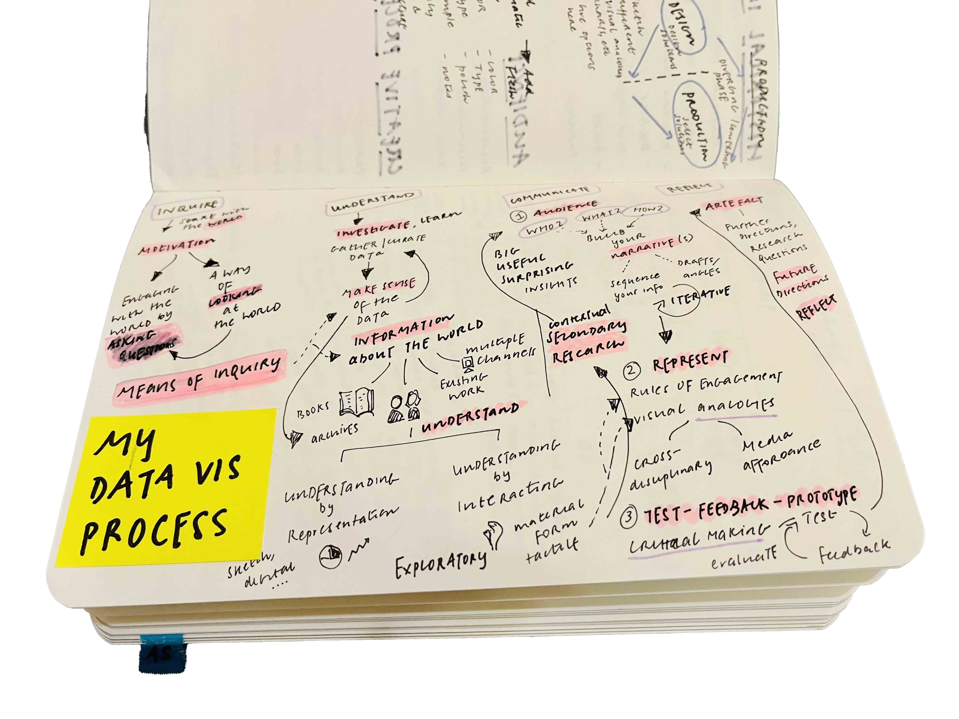
My data visualisation process is a lens through which I seek to ask and answer questions about the world and communicate my learnings. The process is driven throughout by the curiosity to make sense of an observation, experience, or an area of interest and the desire to meaningfully engage others with my point of view.
Data as a means of inquiry
Following this thread of inquiry naturally leads to seeking relevant context and data. The context helps inform the data, sheds light on well-established insights in the field & uncovers new paths for further inquiry. Gathering and curating data provides grounding and a tangible way to engage with and build understanding. This process is iterative, peeling away deeper layers of nuance as more data and context are integrated.
Data as a method of communication
To share the learnings from the inquiry, I turn to the essential questions of communication: who is the audience, what do I need to say, and how do I say it effectively? A powerful metaphor, natural encodings, and the right choice of media can be critical points of leverage at this stage. I look out for cross-disciplinary sources of inspiration that can inform the design direction of my visualisation. The final step is to share the work, seek out feedback, and reflect on future directions for research and further questions for consideration.