Defining Data Visualisation
- Data Visualisation
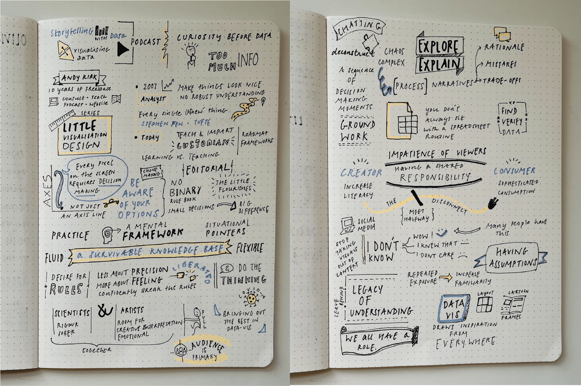
Dispute in definitions
Given the growing multitude of inter-disciplinary practitioners and the wide variety of work produced by them, it’s no surprise that the definition of data visualisation is in flux. Different groups emphasise what matters to them & to their audiences. Some focus on the visual & aesthetic qualities of the work while others treat visualisations as a purely cognitive tool, as outlined by Steven Braun in his paper [1]. A dispute in definitions is often a sign of a field undergoing an active transformation. In that spirit, I would love to add my own to the mix.
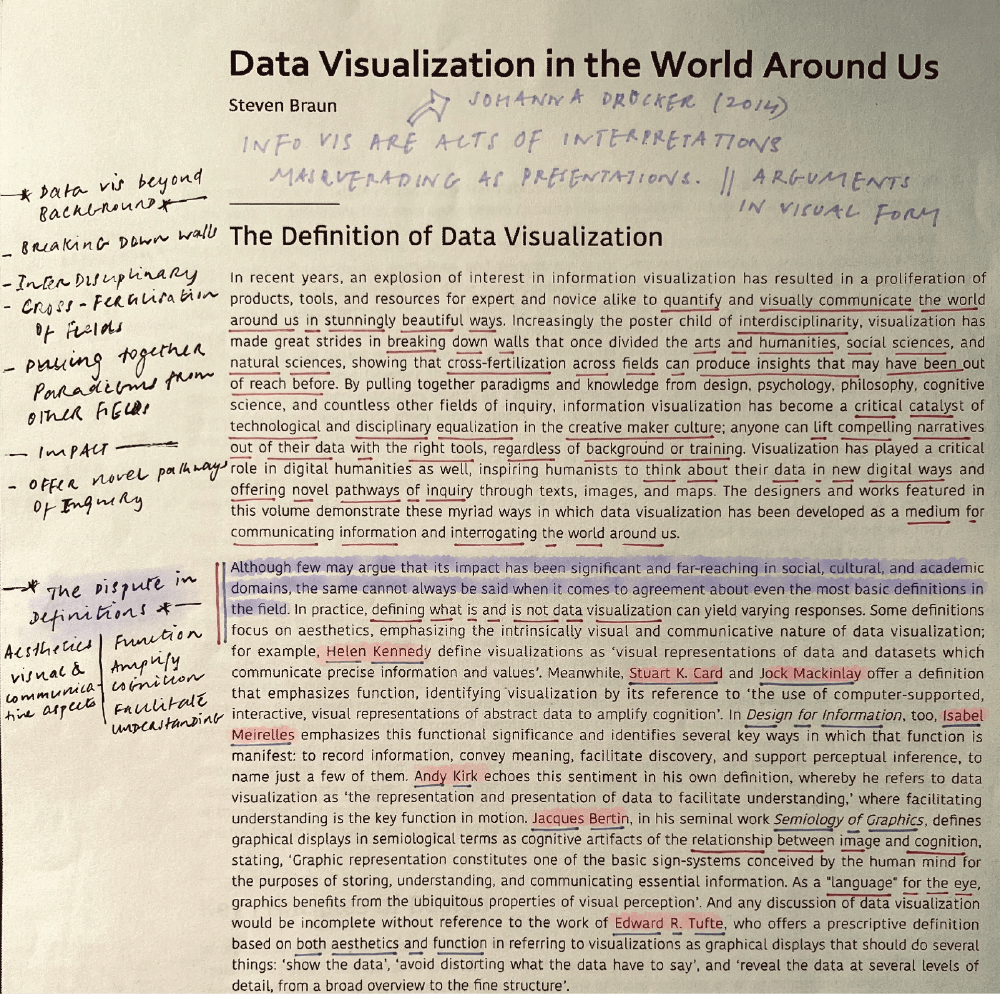
The majority of information graphics, for instance, are shaped by the disciplines from which they have sprung: statistics, empirical sciences, and business. Can these graphic languages serve humanistic fields where interpretation, ambiguity, inference, and qualitative judgment take priority over quantitative statements and presentations of “facts”?
My definition
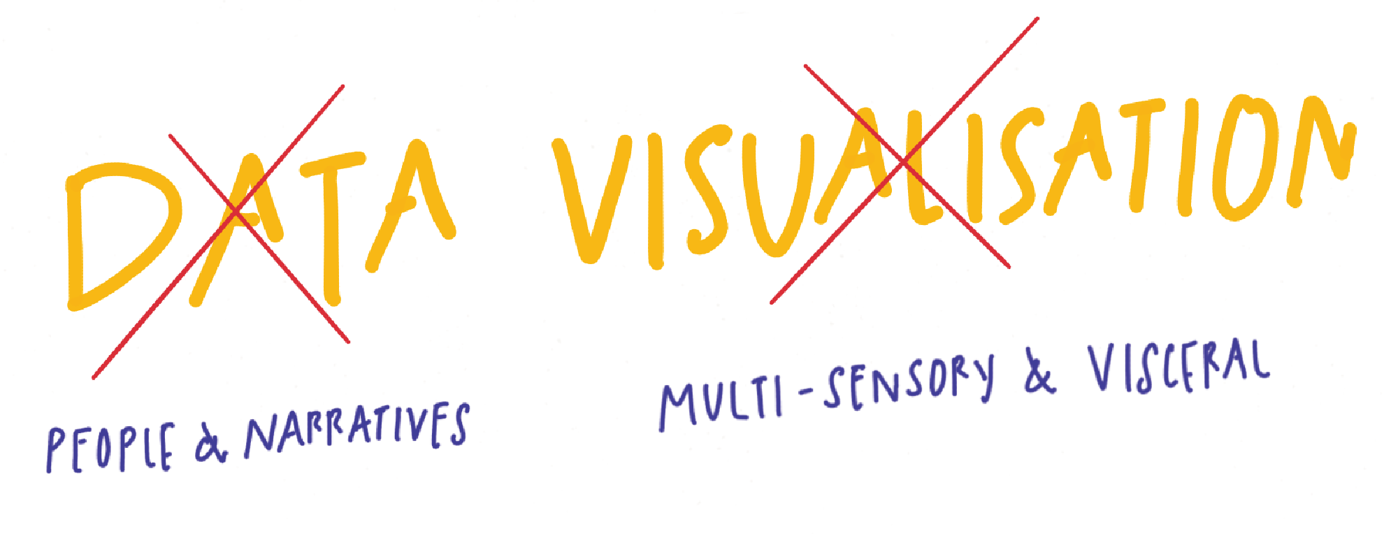
The essence of data visualisation, I contend, is neither about data nor visualisation.
It's not about data
A visualisation should be driven not by the available data but by the surrounding context of the people and their stories. By losing sight of the context, a practitioner is at the risk of ignoring non-quantitative forms of knowledge and its potential to add nuance & richness to the work. Devoid of a narrative, a visualisation becomes flat & loses its capacity to invoke empathy. Data is a means to an end & is only as valuable as its ability to answer our questions about our world.
It’s not about visualisation
We navigate and understand the world through all our senses & not just the visual sense. An over emphasis on the visual alone obscures other means of making data tangible & accessible. The ambiguous, sensory, and emotional nature of the human experience compels us to look beyond objective & visual representation of data. A multi-sensory approach holds the potential to create visceral, intriguing, and more memorable experiences.