Week 08
This week’s been all about process. David McCandless' in-person workshop was a great way to start the week. We looked at a concept-led approach to data visualisation and what makes a good visualisation.
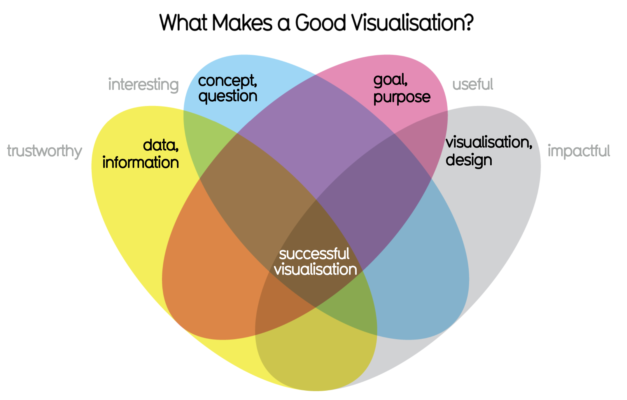
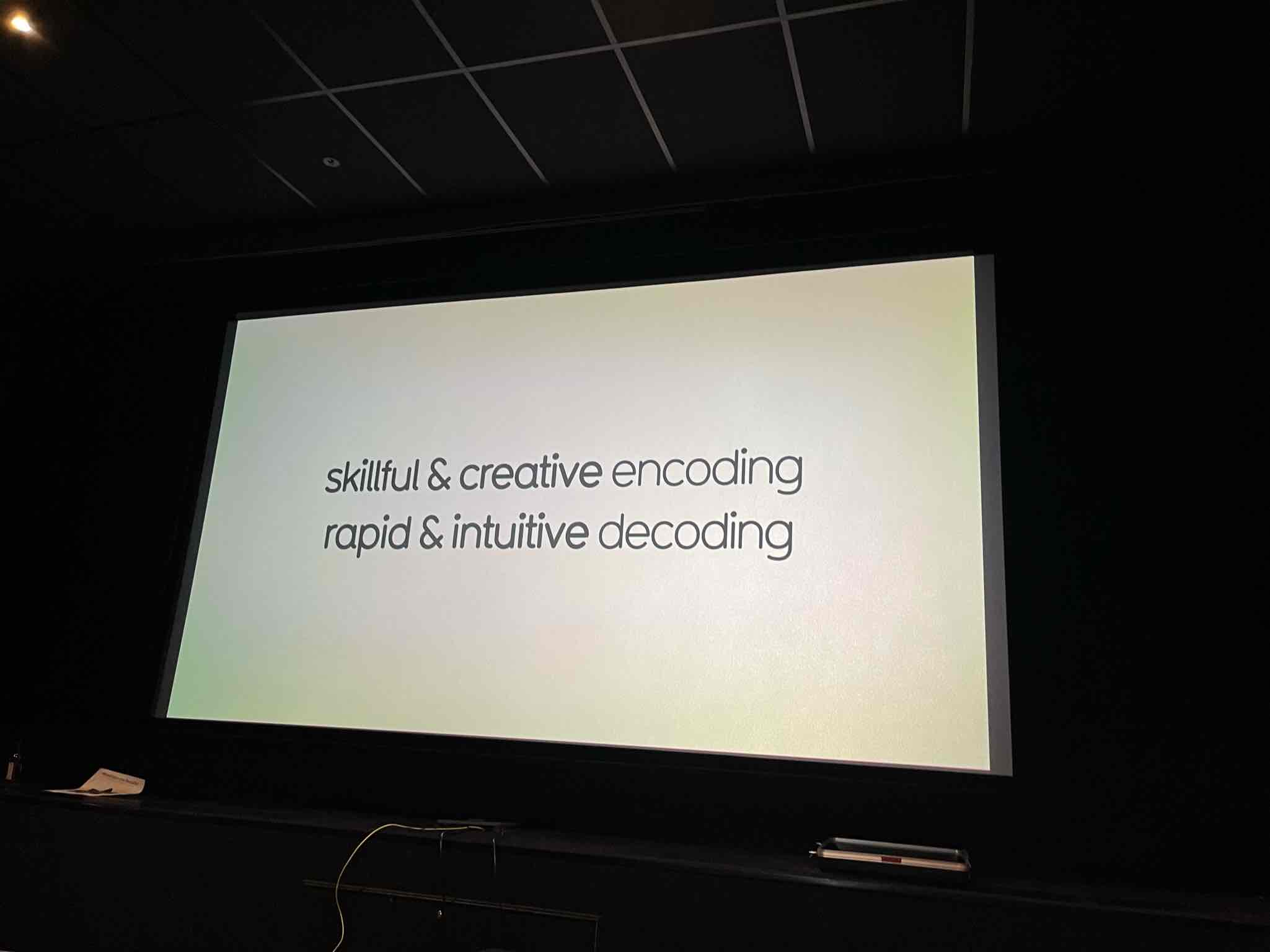
David shared his data visualisation process, which was quite insightful given that I had been learning and researching the processes of other practitioners. We learnt about concepting and did some freeform concepting exercises. It was fascinating to apply a camera analogy to visualisation and compare different “modes” one could play with. A peek into IIB's chart type categorisation was a great way to understand how to identify your metrics, select the appropriate chart, consider visual channels for your visualisation, and map the metrics to those channels. We explored end-to-end conceptualisation of an infographic taking into account elements like the title, visualisation angles, visuals elements like hierarchy, graphics, fonts, and colour.
In a course workshop with Tizianna, we went over some inspiring examples of historic visualisations and the use of analogies & visual metaphors to make our visualisations relatable.
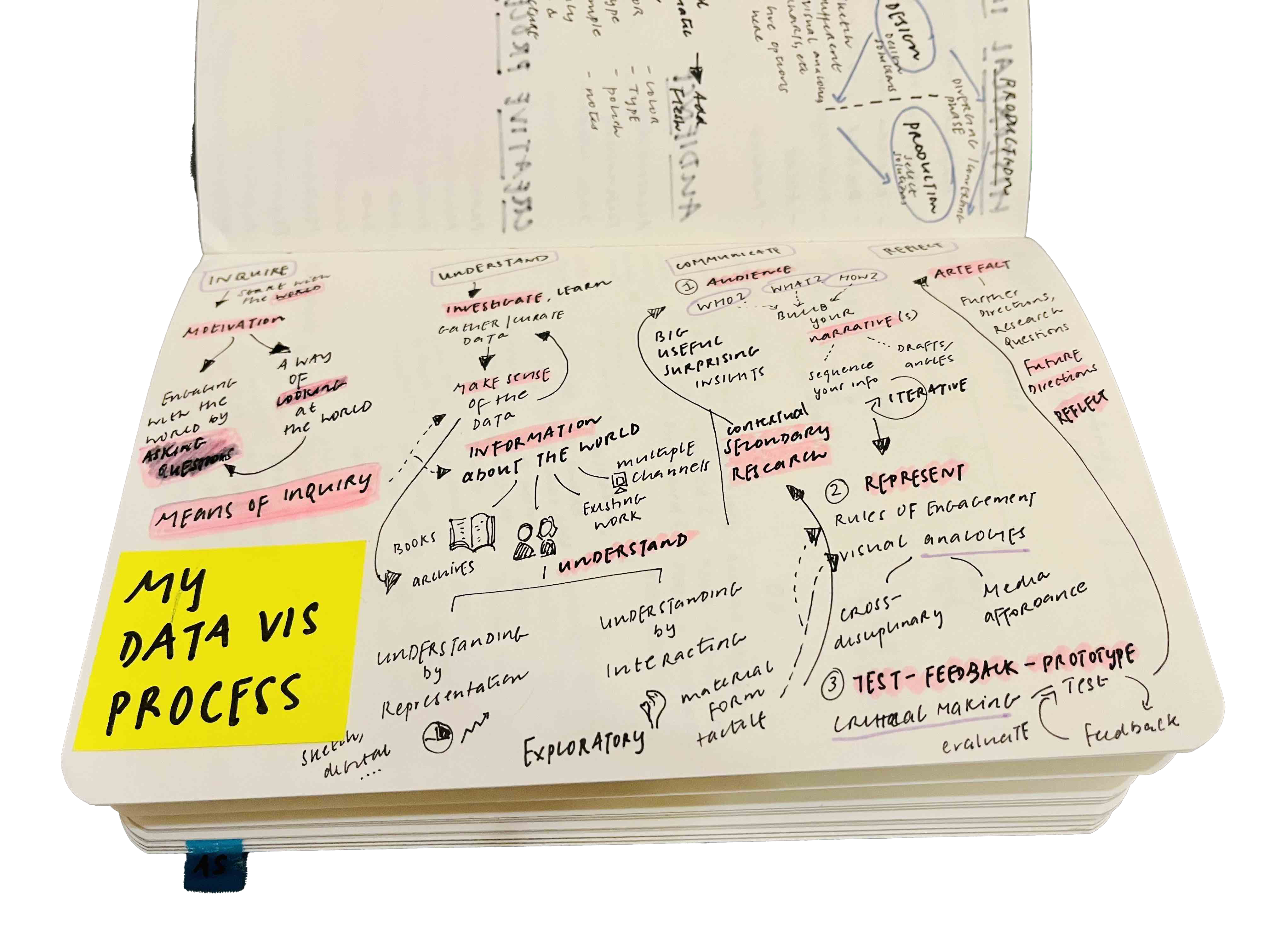
We also looked into different creative processes and I revisited my data visualisation process to add a few details.
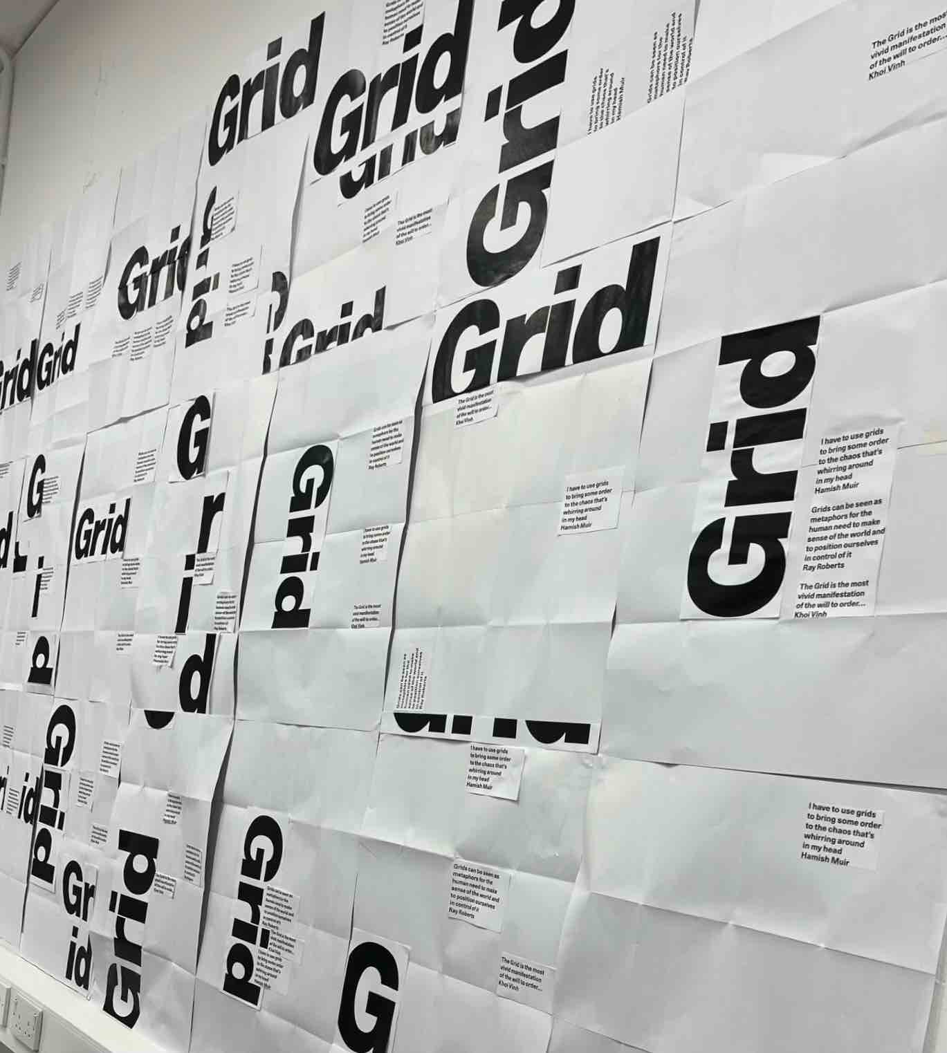
Continuing our exercises on visual design basics, we addressed grids and type hierarchy this week.