Week 07
I am reading Bruno Murari's Design as Art and thinking about the language of signs and symbols and how it conditions our activities. I am inspired by his idea of using symbols like words in a poem and how they can share multiple meanings depending on usage. A beautiful blend of semiotics and context!

We had a brief introduction to color theory, use of color scales in data visualisation and accessible and inclusive designs for a color blind audience.
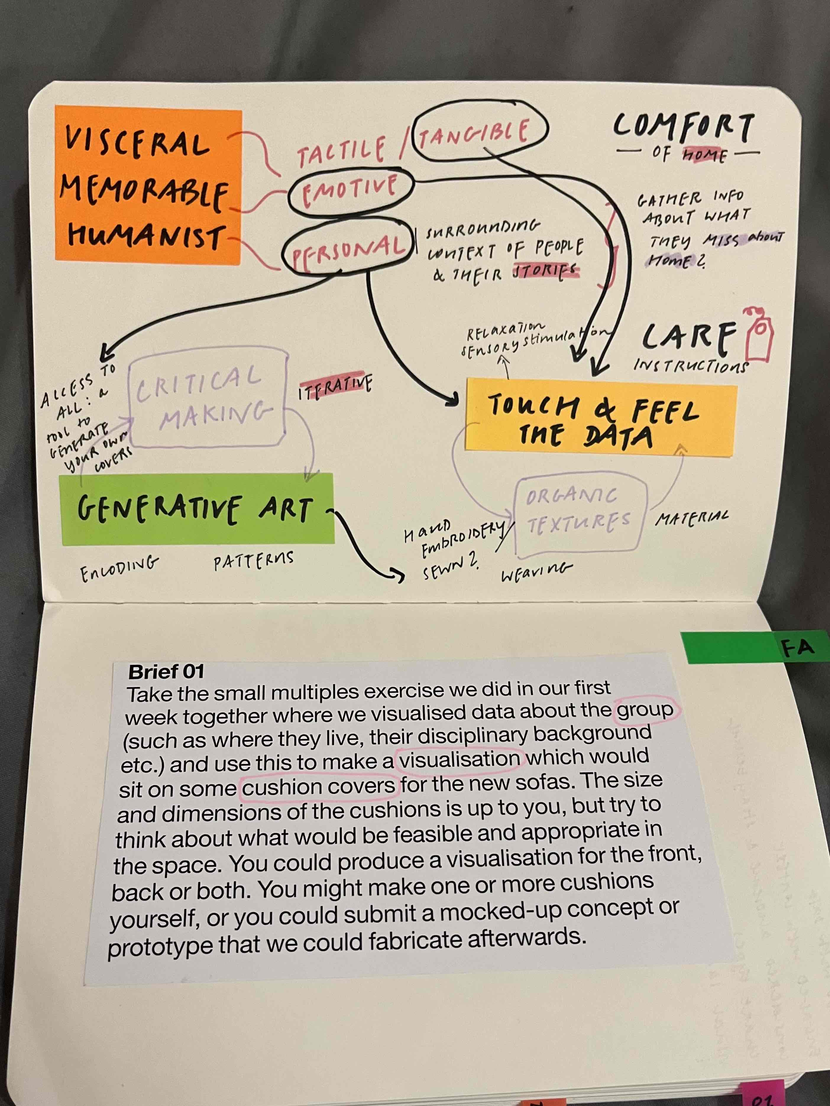
I began brainstorming ideas for our formative assessment brief. With the intention of creating data-driven cushion covers, I am considering my approach and what aspects of my peers I want to capture.
This week, I also visualised connections between the various key texts in data visualisation that I have been reading. My categorisation tries to break down each practitioner's approach towards knowledge, its visualisation & their audience.

Two broad perspectives emerge:
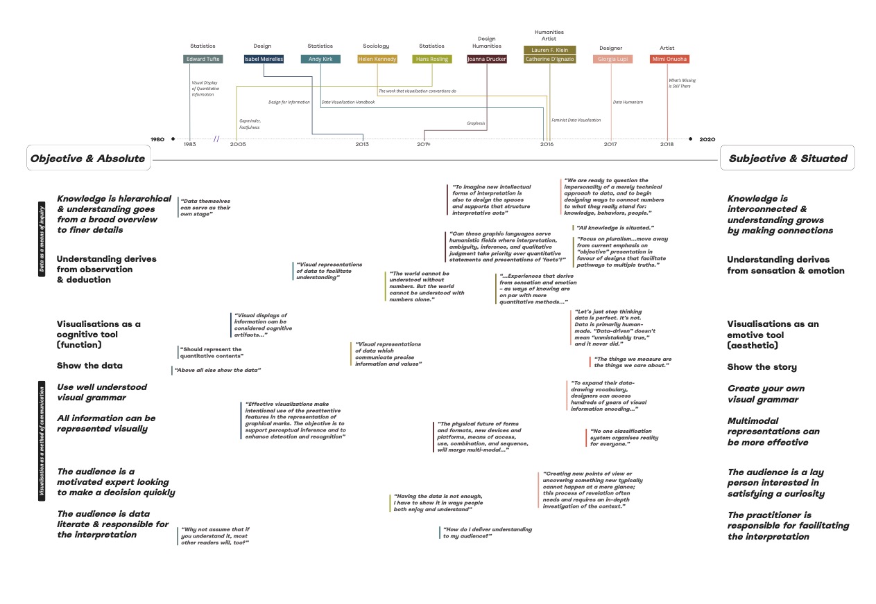
One group of practitioners consider data as objective & absolute source of knowledge, its visualisation as a cognitive artefact & their audience as data-literate experts.
Another considers knowledge as subjective & situated, its visualisation as an emotive tool & their audience as curious non-experts.
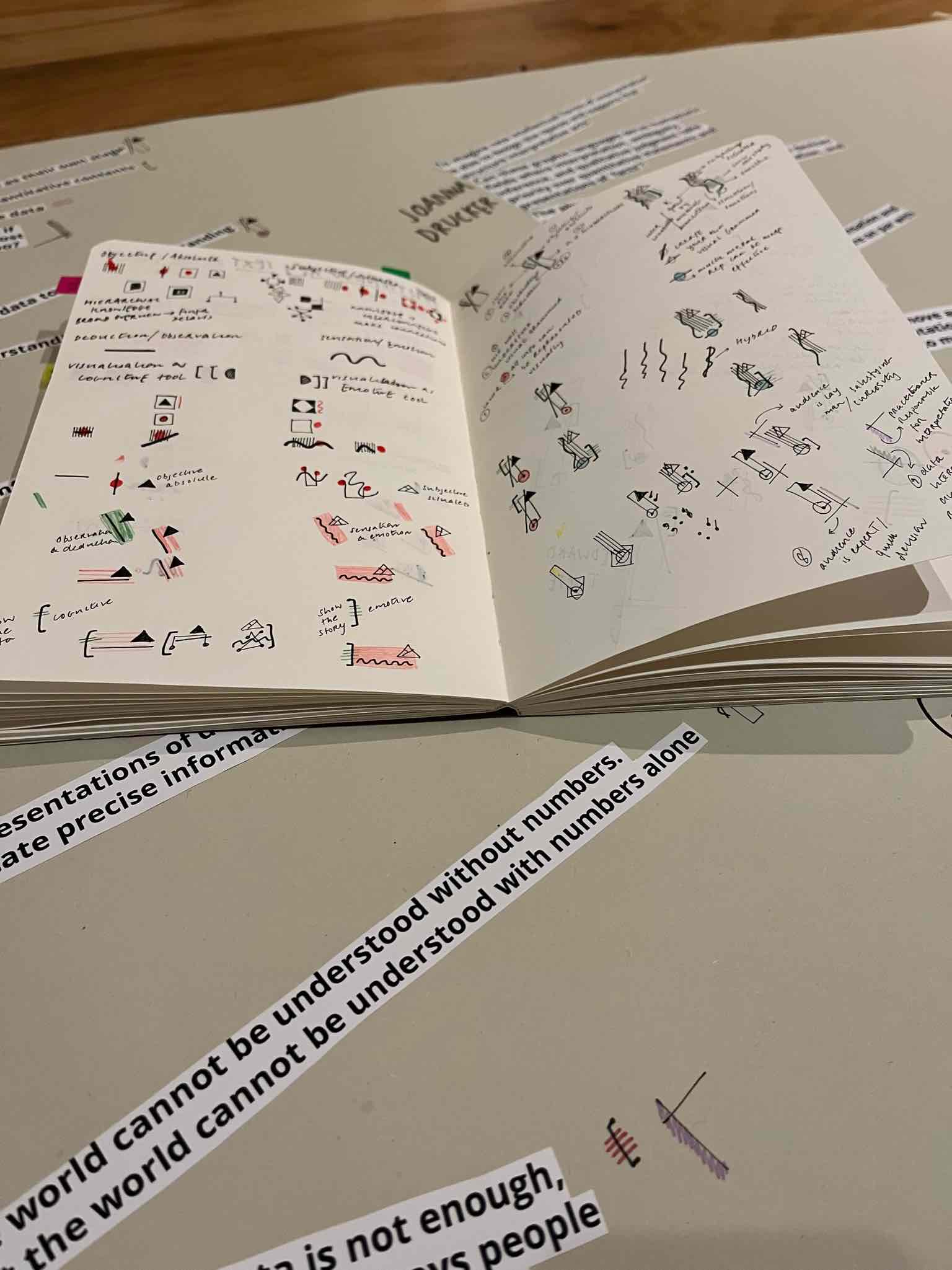
I also came up with individual data-driven badges for each practitioner based on their approaches.