Week 26
This week, I continued developing my work for the Solar Protocol brief and focused on planning & refining a new project idea on colors.
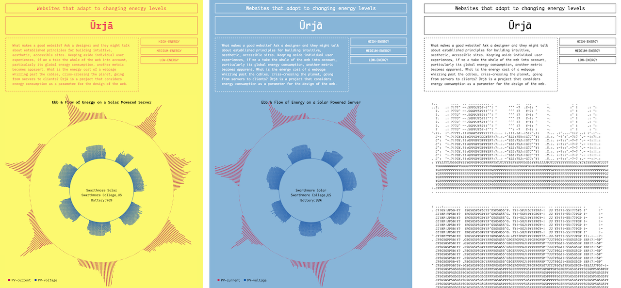
For the Solar Protocol outcome, I explored ways of designing website experiences that dynamically adjust to meet energy requirements. I continued developing the visualisation considering how it would adapt to energy levels.

I proceeded to create wireframes that outlined the website's structure, focusing on how aspects such as functionality and content would adapt according to the available energy. I drew parallels between our everyday conversations and how servers and clients communicate. In our conversations, we naturally assess and adjust our discourse based on our own and our partner's energy levels. Similarly, in the context of server-client interaction, both sides need to evaluate each other's energy levels to determine a suitable design that aligns with their respective capacities.
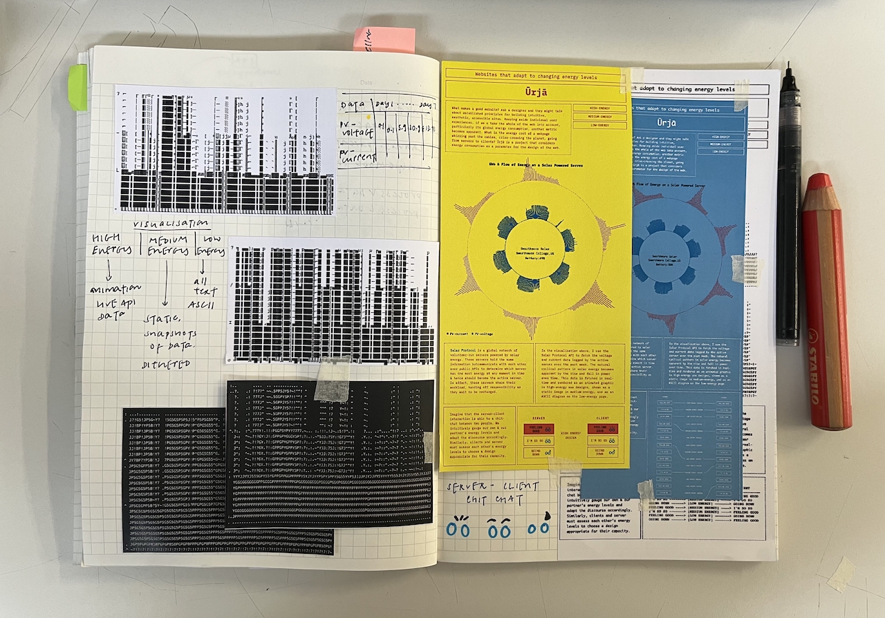
Working on this project with a focus on energy as a data experience has prompted me to think critically about our energy consumption and how it would shape my design decisions moving forward. I called this project Ūrjā which translates to energy in Sanskrit.
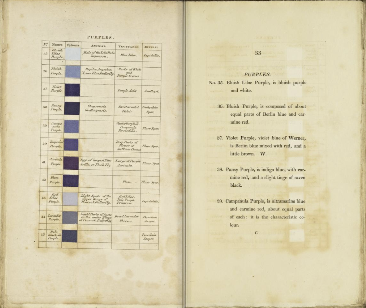
For an upcoming project, I am looking at Werner’s Nomenclature of Colors which suggests a framework for categorising colors, drawing inspiration from elements found in the natural world. I am looking at this project as a way of understanding and visualising connections between hues. I found inspiration through exploring the digital recreation of the manuscript and it’s compilation into a dataset by data artist Nicholas Rougeux. Through this project, I did like to visualise connections between hues and open up new possibilities for studying and understanding this rich content.