Nova MVP
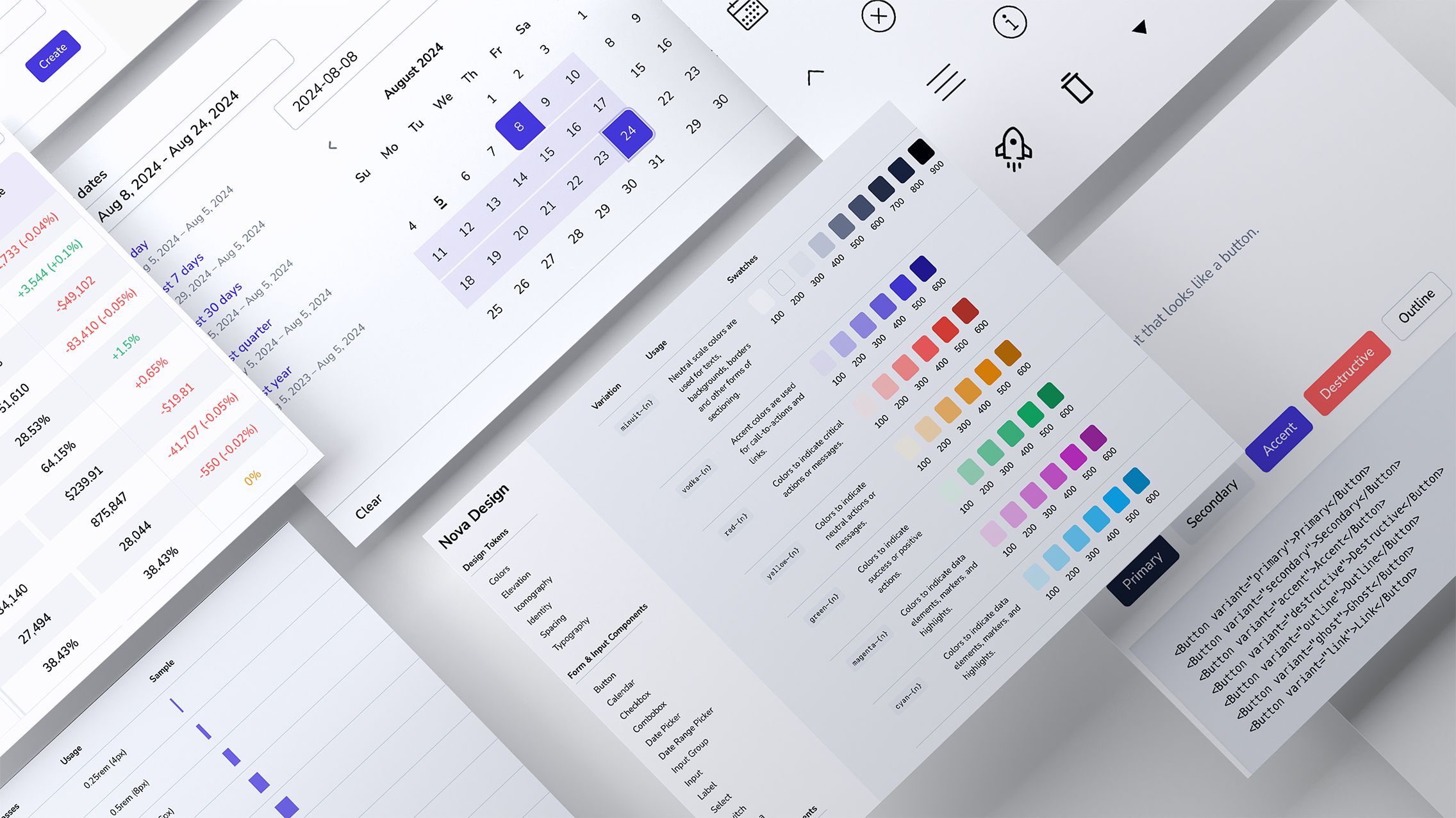
Nova is an early-stage analytics platform building the next generation of tools for sellers to effectively understand and act on their data. Embedded within a small, fast-paced team, I helped define and shape the product 0 -> 1: from developing a comprehensive understanding of the opportunity and audience, to streamlining user workflows and creating a Minimal Viable Product.
Nova shifts sellers from a panic-driven mode of operation to one of calm, considered action based on trust and understanding of the data.
Product Definition
I facilitated a series of workshops with the product team, including a domain expert, to develop a clear and concise understanding of the product’s audience and their needs.
Audience
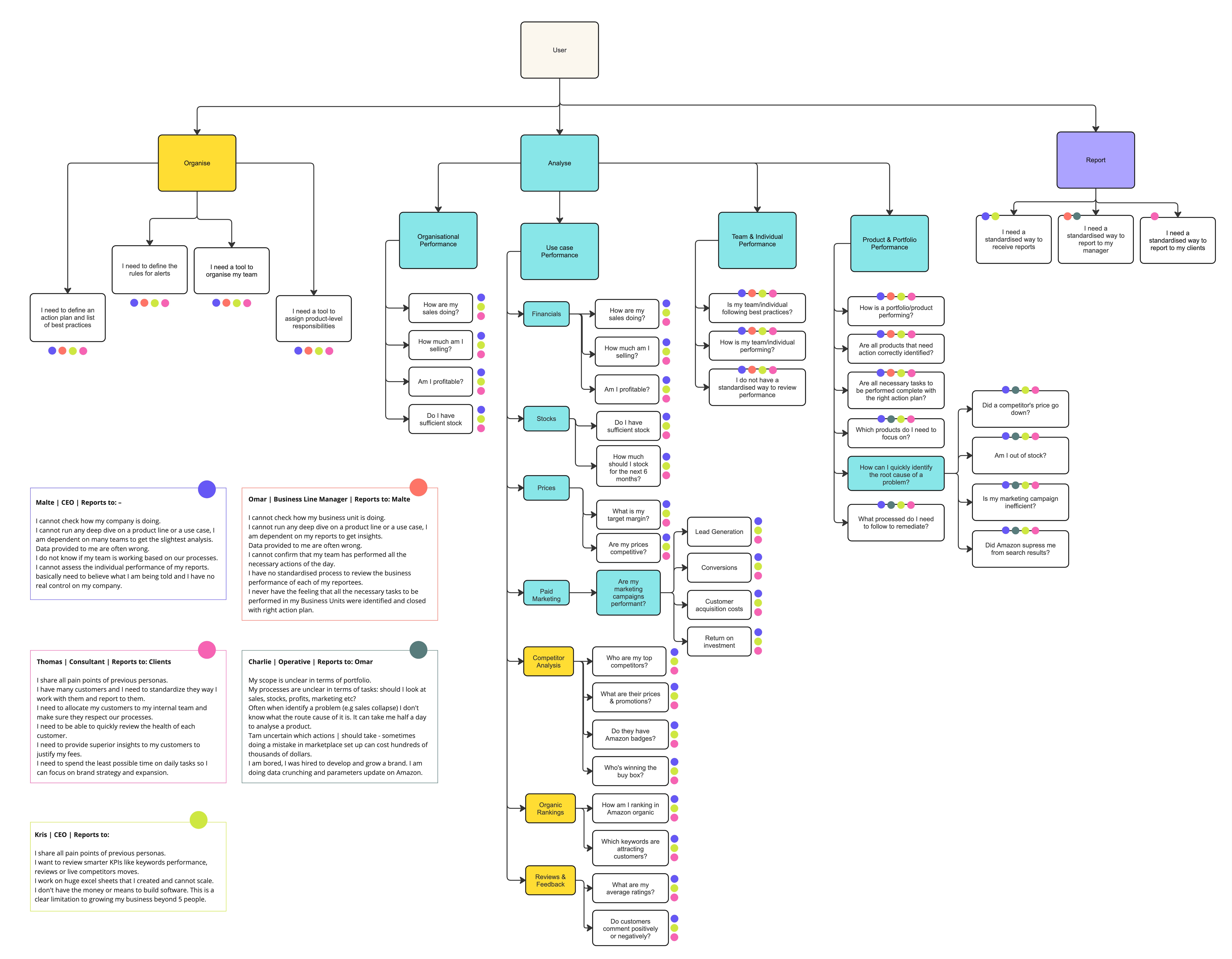
A deep dive into the domain revealed three distinct seller types, each with varying end users and needs:
Large sellers organised hierarchically, managing thousands of products across marketplaces and countries;
Small-to-medium-sized businesses with up to a dozen operatives managing a few hundred products;
Consulting agencies authorised by sellers to manage their portfolios.
Within these groups, we categorised user roles by need: executives needing high-level oversight, line managers focused on reporting, operatives requiring actionable, data-driven insights.
Requirements
With different user types defined, we moved on to developing detailed personas to better understand individual requirements. Three broad categories emerged:
Organisational needs to group agents and accounts into teams with a clear hierarchy and responsibilities;
Analytical needs to capture a quick overview of KPIs to understand global performance, with supporting filters and drill-downs;
Reporting needs to create and consume reports by managers within the company or for external clients.
Mapping the User Journey
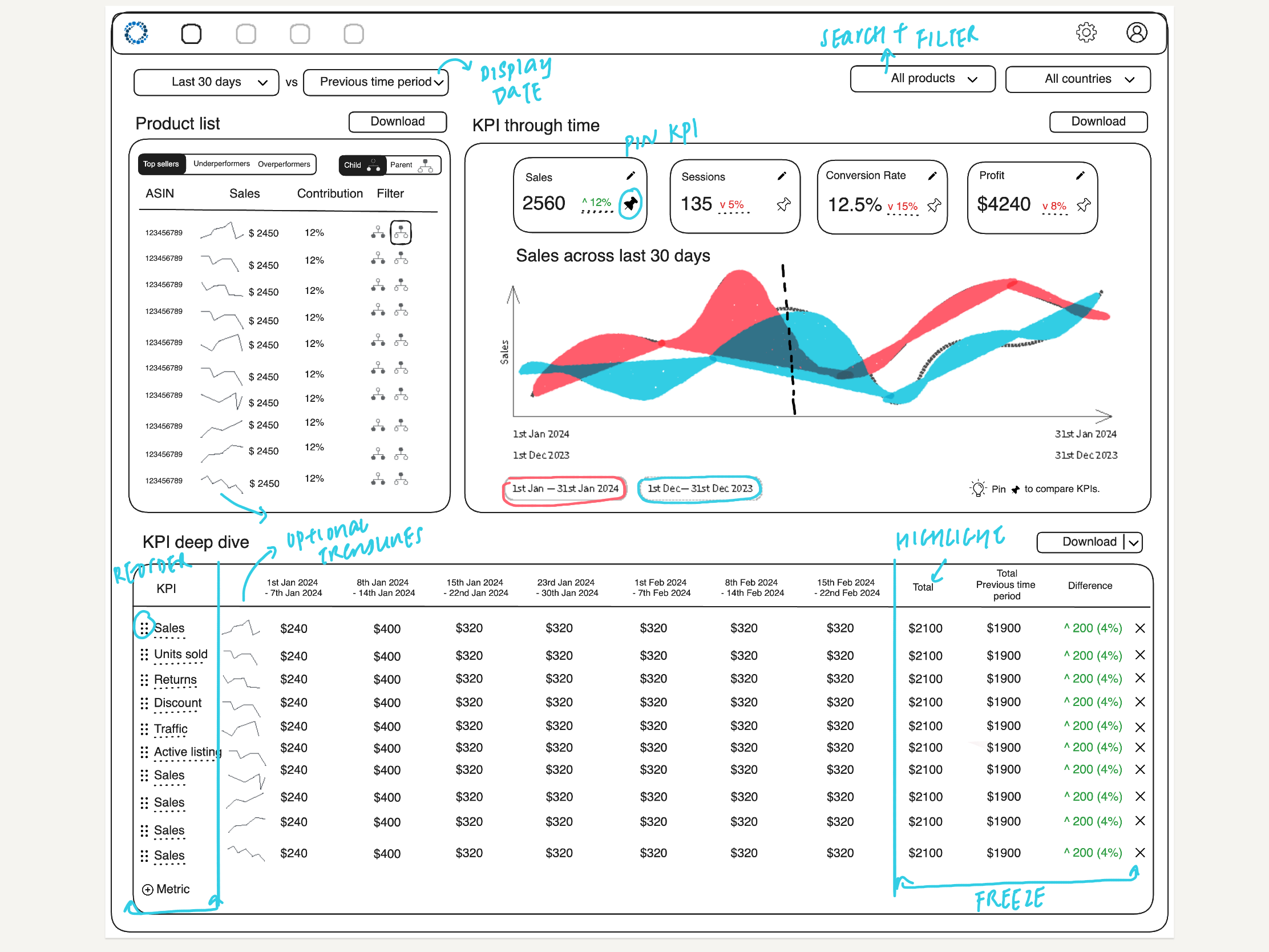
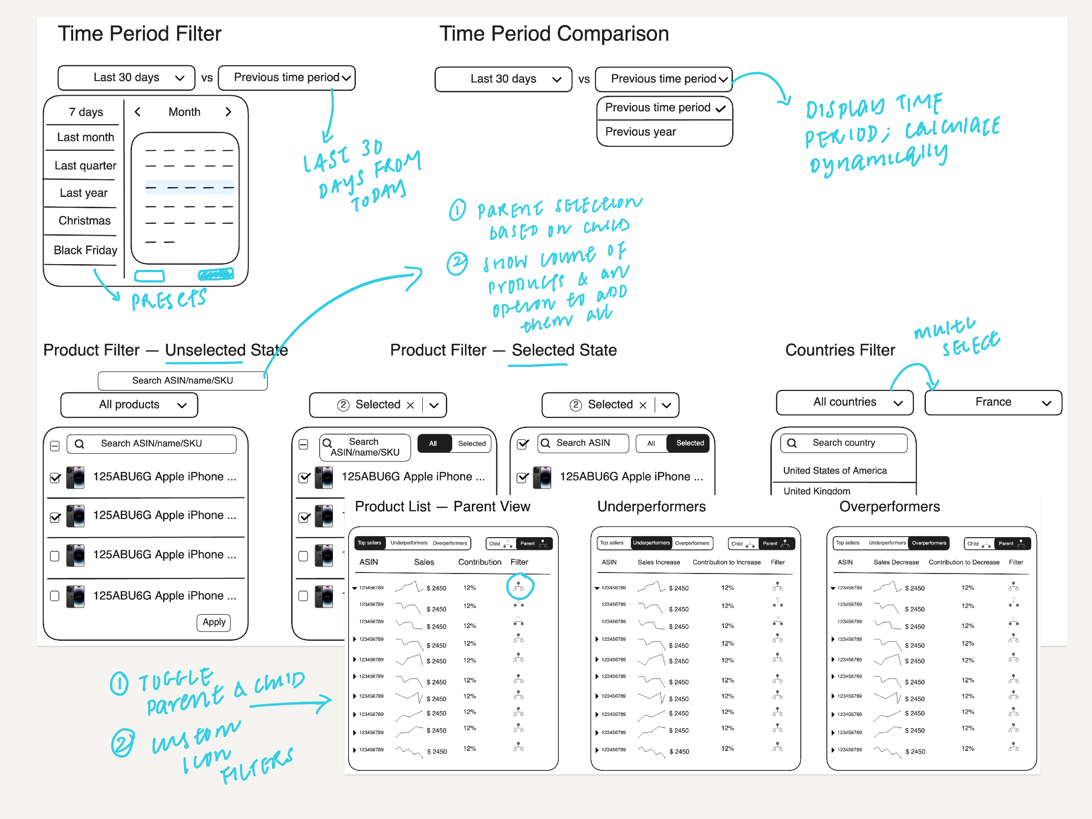
Following the product definition phase, I conducted additional workshops to chalk out various user workflows. This included organisational sign-up and login flows, account setup including connecting to marketplaces and APIs, and a comprehensive analytics page for an overview of key KPI metrics, enhanced by custom filters and drill-down capability.
I sketched out various data views to display metrics over time, considered interactive filtering options across products, marketplaces, date ranges, and a summary panel highlighting top performers and areas needing attention. Rapid prototyping and iterative feedback cycles allowed me to validate design decisions against the data, product needs, and the intended user experience.
Building a Design System
With a firm foundation set by the workflows, I also undertook the task of building a Minimum Viable Design System for Nova comprising:
UI Inventory
After studying existing design systems within the e-commerce space, particularly Polaris by Shopify, I deconstructed the screens into a list of reusable components. These were grouped as well-understood basic components like buttons and dropdowns, as well as custom components such as data tables and charts specific to our use case. The UI inventory doubled as both a guide and a checklist throughout the design and development process.
Design Tokens
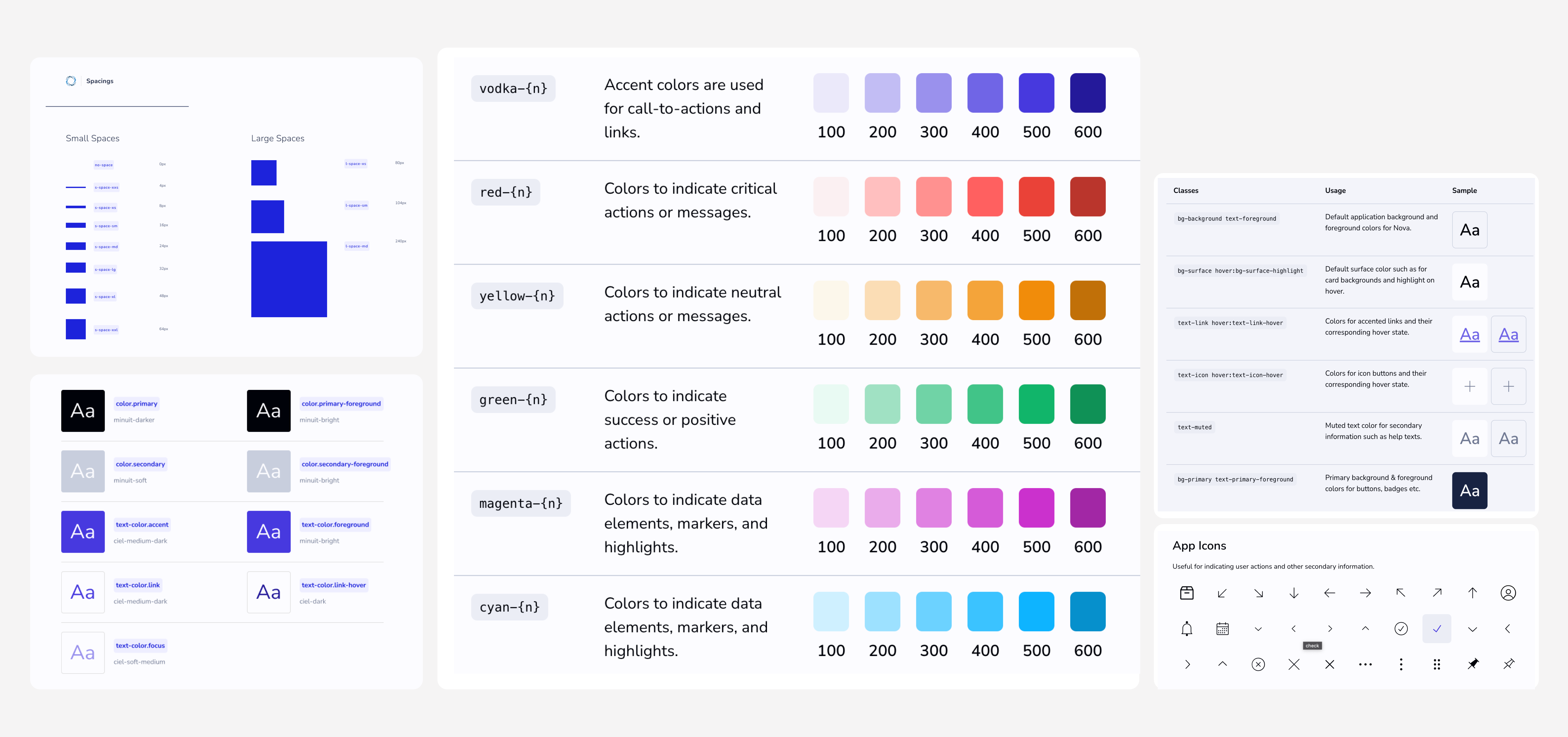
To develop a distinct visual language for Nova, I defined a set of design tokens prioritising readability and information density. These tokens were then configured into Tailwind – the CSS framework used by the team – and documented for reference.
Component Development
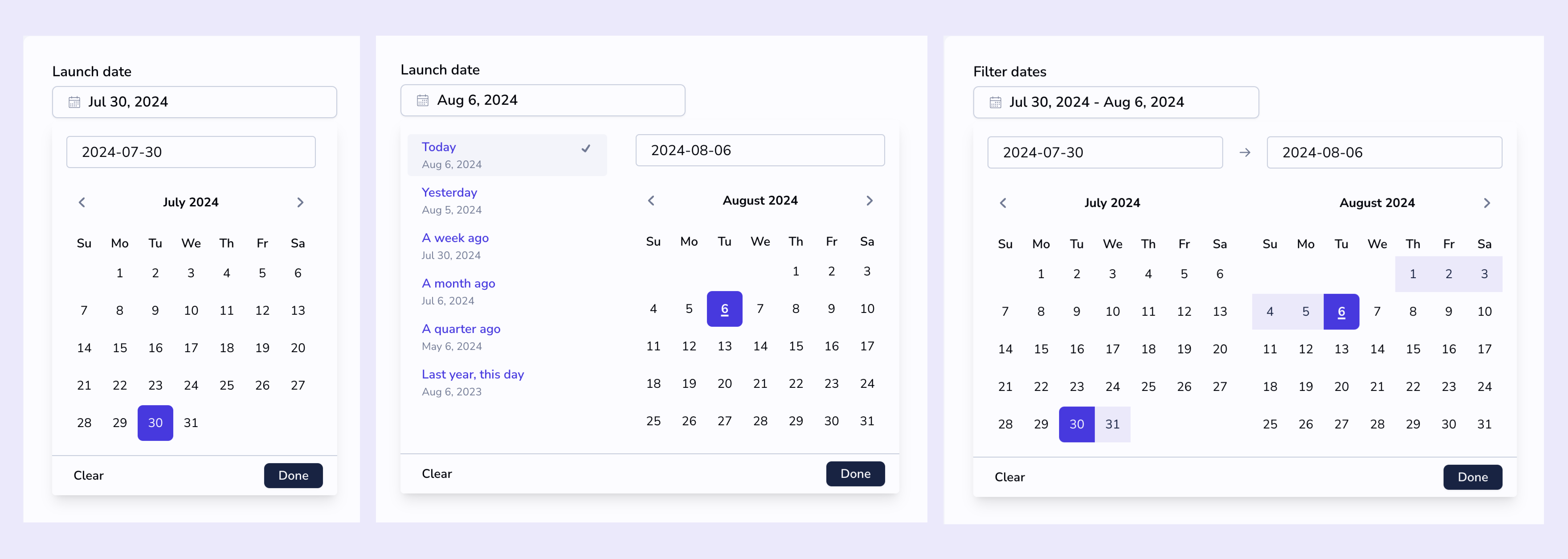
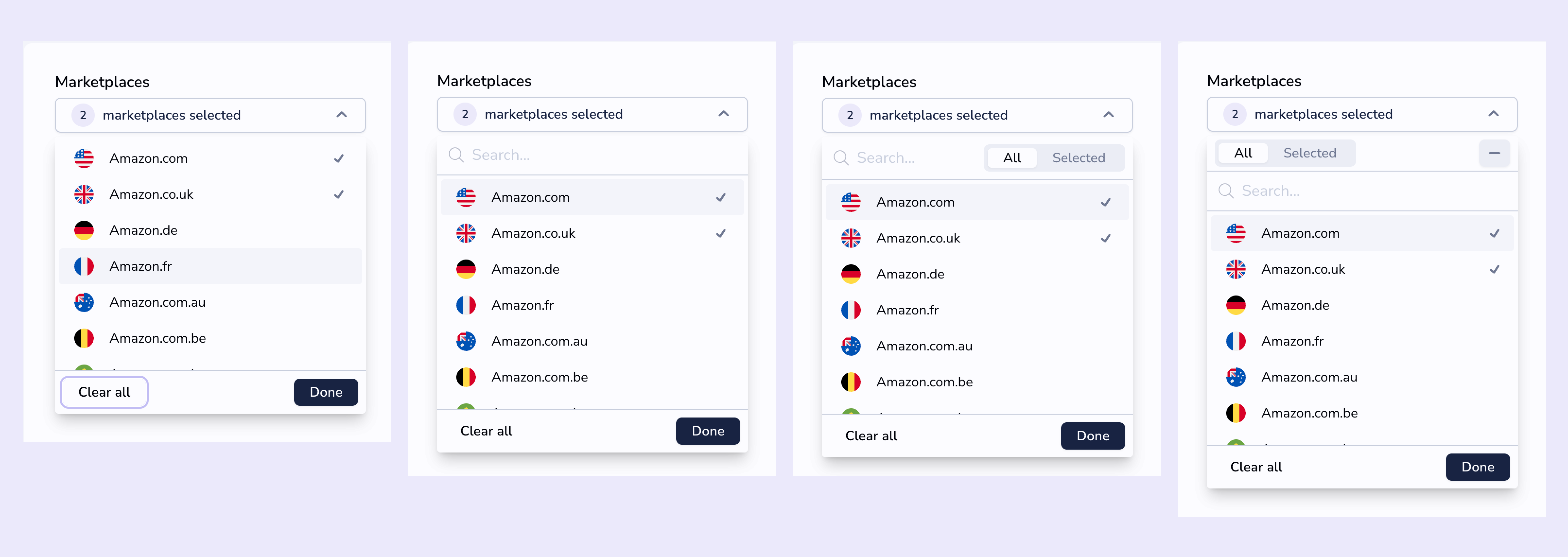
Partnering closely with the front-end developer, we iterated on the UI components directly in React and CSS. Instead of relying on handing over high-fidelity designs to the developers, we chose a more integrated, collaborative approach with design and development working together in rapid iterations, designing directly in the browser. This helped us surface and address design issues early on in the process, significantly cut down development time, and reduced duplication of effort.
Style Guide
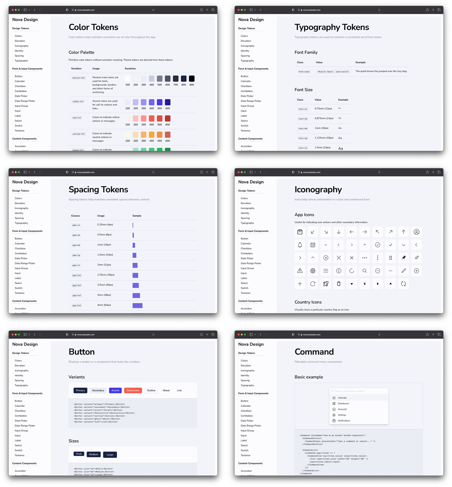
To ensure the components are documented and used as per the design intent, we created a style guide with detailed examples, usage guidelines, and suggested best practices. The style guide was published internally and kept up-to-date throughout the design and development process, serving as a central point for gathering feedback from within and outside the engineering team.
- Client: Nova Data
- Role: Product Design & Data Visualisation Consultant