Building BDA's eAuction Platform
- Civic Tech ·
- Tools ·
- Volunteering
In early January, VK and I were added to a WhatsApp group connected to the Bangalore Development Authority (BDA). On January 4, an eAuction poster was shared in it. It was dense, with no visual hierarchy, hard to scan and difficult to understand. All this would often lead to invalid bids.
We were also told that it was kept this way by design, to discourage broader participation and limit the auction to a close insider circle. That led to a simple question and a string of efforts on how this information could be made clearer and transparent for citizens.
At Zen Citizen, we often encounter this problem. Public data exists, but it is usually fragmented, dense, and difficult to navigate. When the BDA Commissioner asked if we could help, it was a pivotal moment, and we readily agreed to explore what could be done.
Framing the Problem
The issue was not simply one of presentation. Government data is often genuinely hard to use. For this eAuction, information was spread across multiple formats and locations:
- Notices and site lists were published as dense PDFs, important dates were getting mixed into long walls of text.
- Eligibility criteria, documents, and financial details all lived in different places.
- Site information was available in a document, separate from location coordinates.
- Understanding the full process and which site was where required manual cross-referencing between different sources.
While all the required information existed, it was fragmented and not designed to be consumed together. For a citizen, this means additional effort just to build a basic understanding of the auction before even deciding whether to participate.
Our goal was to bring this information together in a way that reduced that effort, without altering the underlying data or diluting legal enforceability.
Collaboration and Process
This work was completed in about twenty days since the first conversation. During this time, we:
- Familiarised ourselves with the auction process and terminology.
- Sought clarity on what information was mandatory versus contextual.
- Coordinated with multiple teams to gather data and documentation.
- Kept iterating while working with delayed or partial inputs.
Everyone involved in the process recognised the intent behind the work and were open to collaboration. That openness enabled steady progress despite constraints.
Design Goals
We aligned early on a few core objectives:
- Make information easy to scan. Key dates, steps, and requirements should be visible upfront.
- Consolidate information. One place that explains both the auction process and lets user explore available sites.
- Reduce friction. Clear communication can reduce invalid bids, follow-up calls, and grievances.
- Reflect a more transparent, citizen-centric tone. Communication should feel deliberate and respectful of the user.
Working with Government Data
A significant part of the work involved understanding and reconciling data. Some of the challenges included:
- Missing or inconsistent sites and geographic information.
- Differences in numerical figures across documents.
- Boundary data available in varying formats but not meant for web use.
- Some information were even distributed across multiple teams and vendors.
Structuring the Information
One of the first decisions was to separate different types of information instead of compressing everything into a single flow. We structured the platform in such a way that:
- Key dates and sections are clearly listed and visually distinct.
- Key process and auction related details are separated from Terms and Conditions.
- Legal text is preserved but moved out of the primary scanning path.
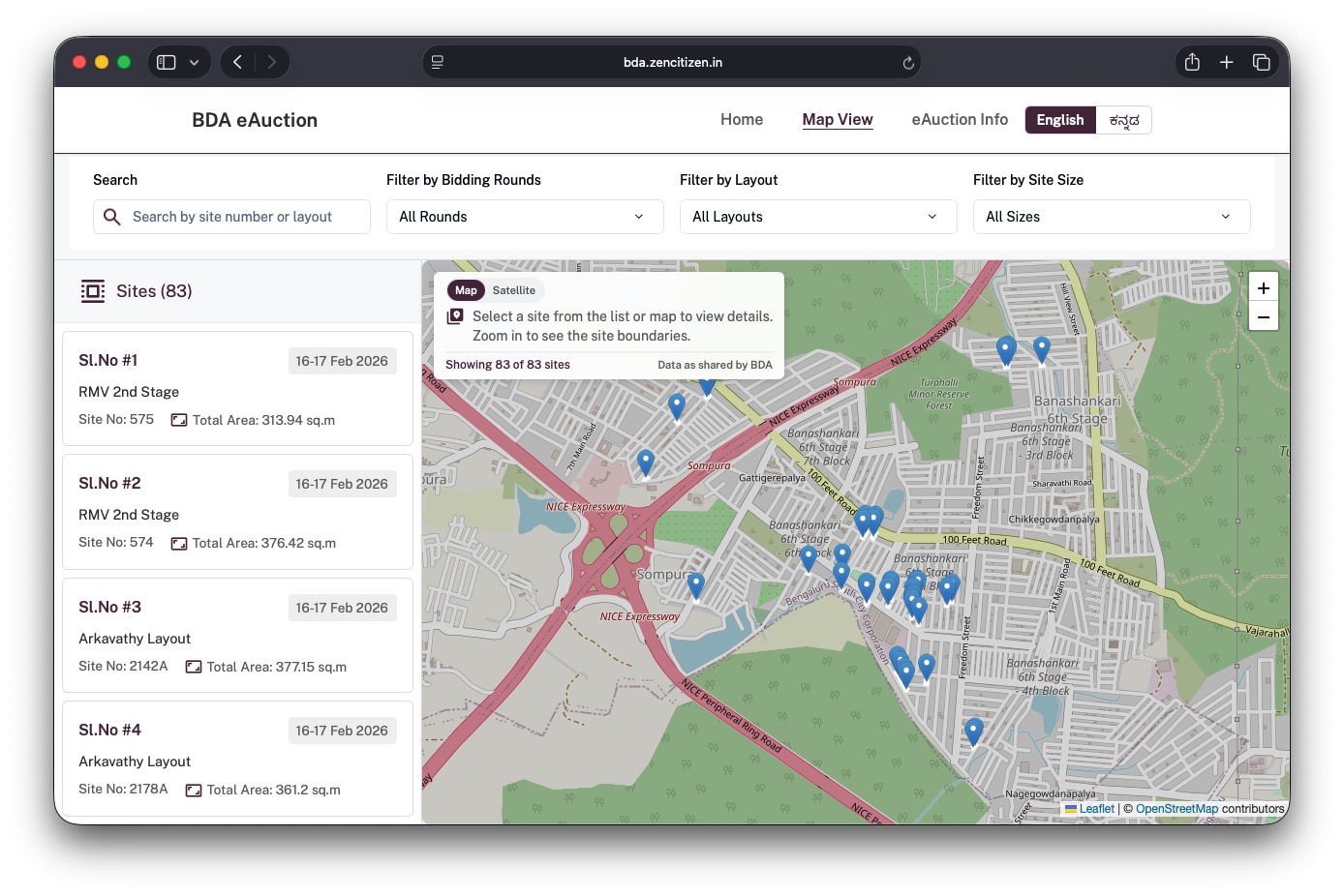
Making Sites Explorable Through the Map
A major intervention was introducing a map-based interface to explore all auction sites. Instead of having users interpret site details and area names abstractly, the platform allows them to:
- See all sites and relevant information laid out on a map.
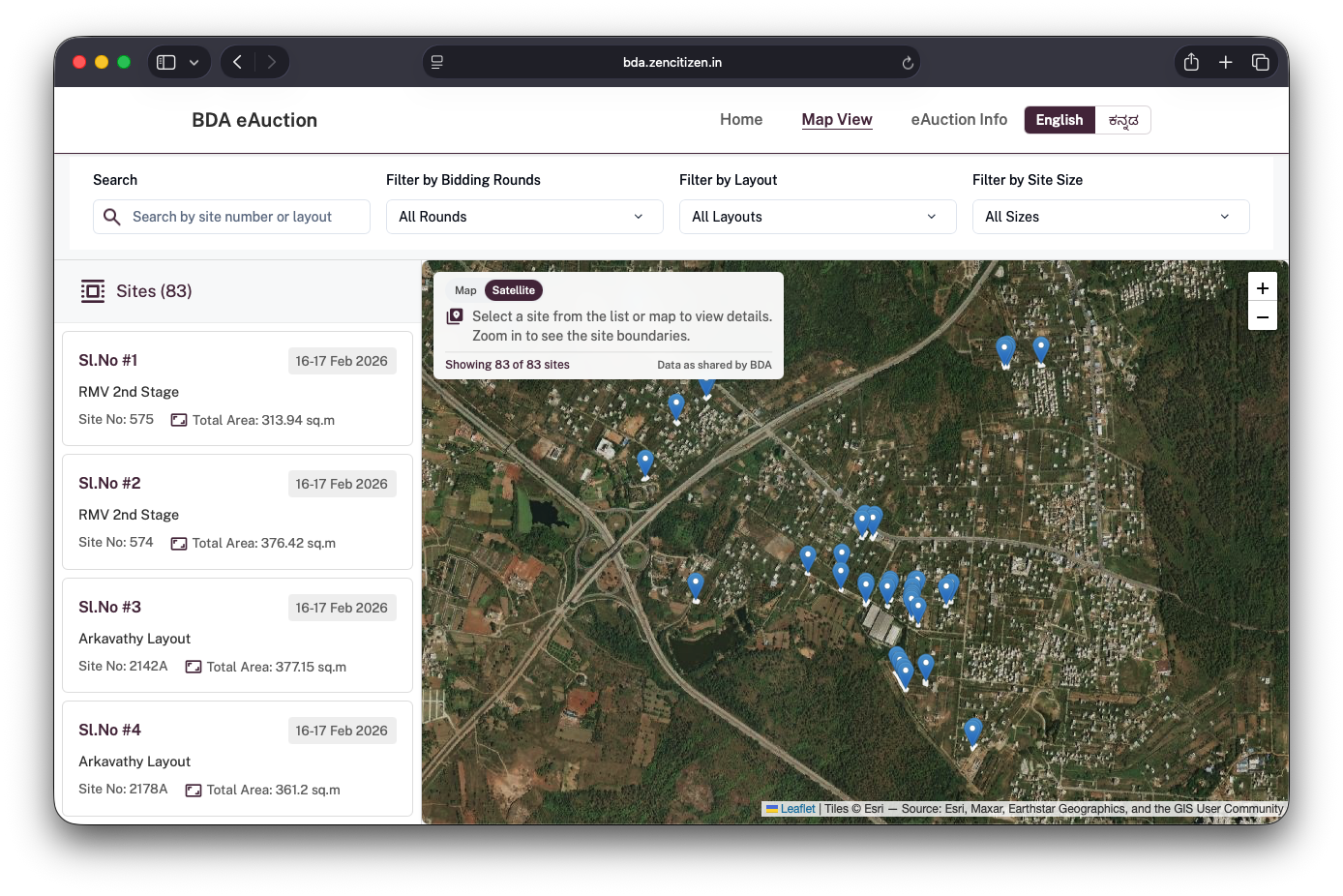
- Switch between street and satellite views to better understand access roads, surrounding development, and the physical context of each site.
- Search and filter sites by area, size, and auction rounds.
- View detailed individual site cards with more information on location, dimensions and pricing.
We also surfaced details that were either missing or difficult to infer earlier, such as:
- Corner vs intermediate sites
- Regular vs odd dimensions
- Site type, directions and area
From a UX perspective, the map helps users build spatial understanding and reduces the effort needed to compare sites.
Design and Technical Considerations
A lot of deliberate choices went into keeping the platform easy to use and extendible. From an implementation perspective, the focus was on simplicity and robustness. The platform is built as a React app and intentionally kept lightweight: no backend or complicated services.
Map implementation (street, satellite, and boundaries)
The map is the core of the experience, so I focused on a few things:
- Two base layers: a street map for navigation context and a satellite layer for on-ground context so people can check access roads, nearby development, and the surroundings before shortlisting a site.
- Validation for missing data: The platform is designed to handle gaps gracefully. Sites without usable coordinates still appear in lists, and the interface avoids implying accuracy where it cannot be guaranteed. This was important from a transparency standpoint. Clear communication also means being clear about limitations.
- Boundaries where available: site boundary data came in varying formats and zipped files, which weren’t inherently web-friendly. I parsed this data as GeoJSON and rendered it as an overlay so the map can show boundary outlines to communicate extent or shape.
Styling and layout:
I used Tailwind for the basics (spacing, typography, common components). For some demanding parts — especially the mobile map experience — I rely on custom CSS.
On desktop, showing a list and a map side-by-side is pretty straightforward. however, on mobile, it’s not because you’re always trading off between “I want to see a list of sites” and “I want to see it on a map.”
On mobile, the map and the site list share the same vertical space. Instead of hiding them behind tabs, I implemented a three-state layout: a default split view, a map-expanded view, and a map-collapsed view. Users can move between these states using a drag handle placed between the list and the map, which allows them to shift focus without losing context.
The code is fully open source github.com/zen-citizen/bda-auction-siteWhy We Took This On
At Zen Citizen, we see communication as part of public infrastructure. When information is unclear, citizens bear the cost — in time, effort, and anxiety.
This project aligned with our broader intent: to demonstrate how thoughtful design and basic technology choices can improve access to public systems without dramatically shifting the underlying processes.
Last-mile impact
This project also reinforced the difference between offering guidance and enabling outcomes. In many public systems, advice and recommendations exist, but the last mile — where information is actually interpreted and used by citizens — often remains unaddressed. Organisations like Zen Citizen operate in that space: translating intent into usable tools and services, and ensuring that guidance is not simply suggested but implemented. Improving public systems requires sustained attention to how people actually encounter and navigate those systems. They do not need to be reinvented.
Clear structure, thoughtful design, and above all, empathy and respect for the user can go a long way in making complex processes more accessible.
What’s Next
Some possible next steps include:
- Hosting the platform directly on the BDA website.
- Extending it into a central reference for all future auctions.
- Improving map layers with clearer layout and division boundaries.
- Exploring assisted guidance or helper features.
- Studying impact such as participation quality and reduction in grievances.