Typography and the Poetics of Form
The study of expressive typography focuses on how form manipulations in a typographic piece can intensify content by conveying emotion, a personality or tone of voice. The history of graphic communication is rich with explorations that expand both the communicative and expressive range of type.
As the visual representation of written language, type embodies the duality of both form and function. In any typographic presentation, the literal meaning of words and sentences on a page is accentuated by its visual appearance and layout. This duality of purpose between the visual and the verbal aspects of typography is well expressed by Cal Swann in Language and Typography.
These two distinct areas often come together in practice as there is clearly a very strong relationship between the conception of the words as a message and their transmission in visible form.
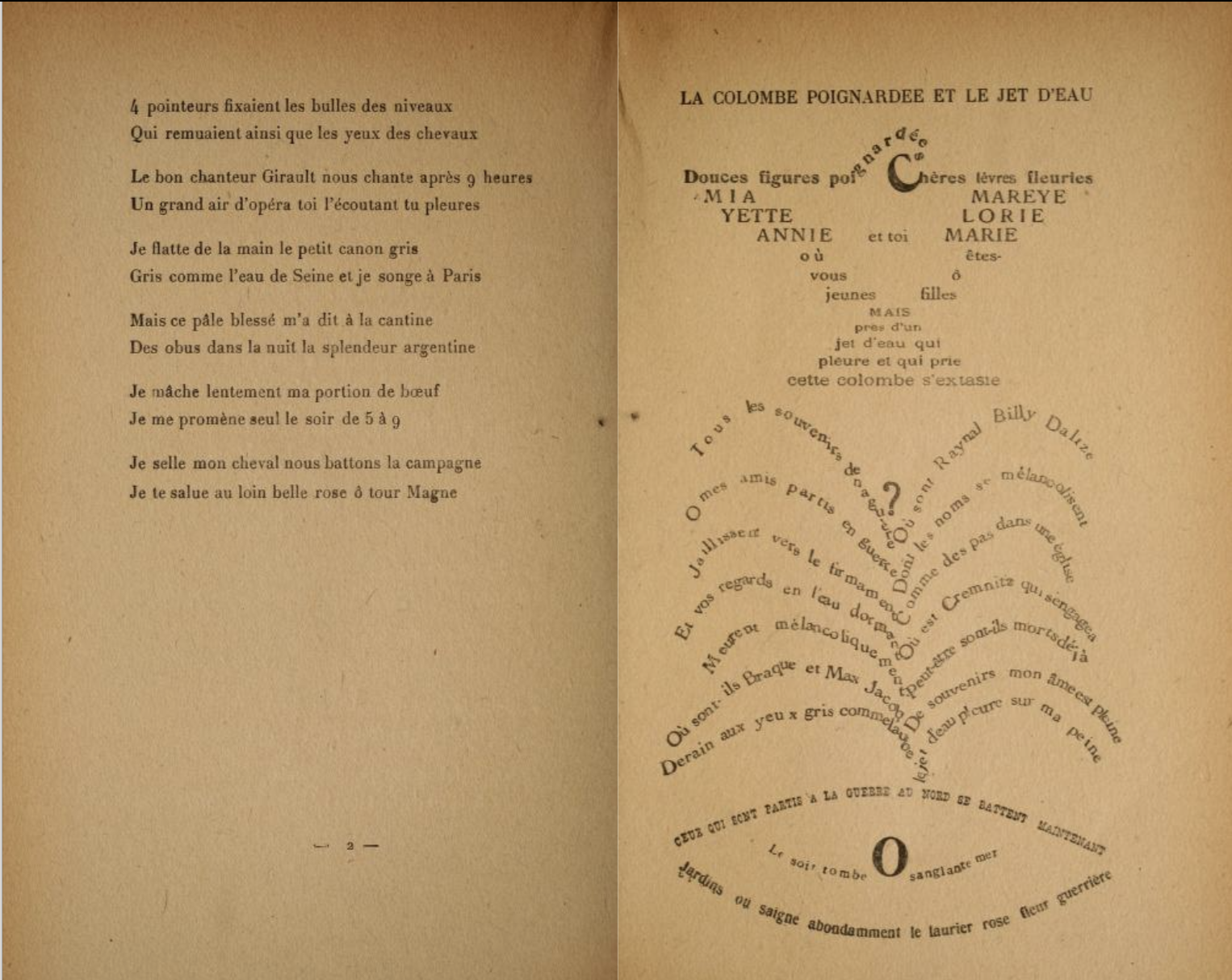
Typographers have always experimented by pushing the limits of expressivity through type, particularly through concrete poetry that emerged during the Dadaist and Futurist eras. Visual poetry broke the conventional notions of traditional typography by deconstructing linear writing and pushing form to the forefront. Exemplary works by Futurist poets like Guillaume Apollinaire and F. T. Marinetti jogged the readers through a creative amalgamation of text and image.
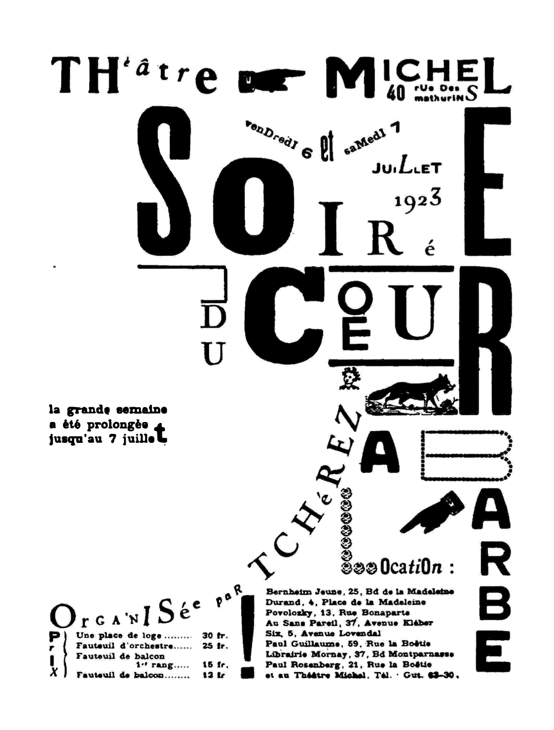
Visual poetry puts the reader through a perceptual struggle of interpreting text-as- image and image-as-text. This simultaneous duality of text and image is reminiscent of the wave-particle duality of quantum mechanics: expressive type is fully describable only as both text and image, separate but inseparable. Dadaists aimed to create pseudo-chaotic compositions by pushing the rules of hierarchy, composition and form. By creating these intense compositions, exploding with energy and dynamism, the reader is both overwhelmed and intrigued.
Poetry and expressive type
Poetry makes for an attractive context for experimenting with expressive typography. The condensed, expressive use of language common in poetry and poetic writings gives ample opportunities for designers to amplify meaning through creative use of type. Another aspect of poetry that is valuable is the intense, rich imagery created using a handful of words, that can be used in creative ways in a typographic piece to render a visual voice to text.
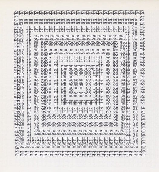
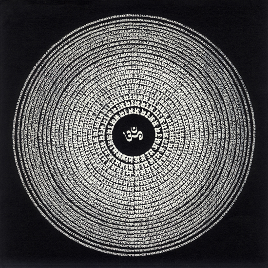
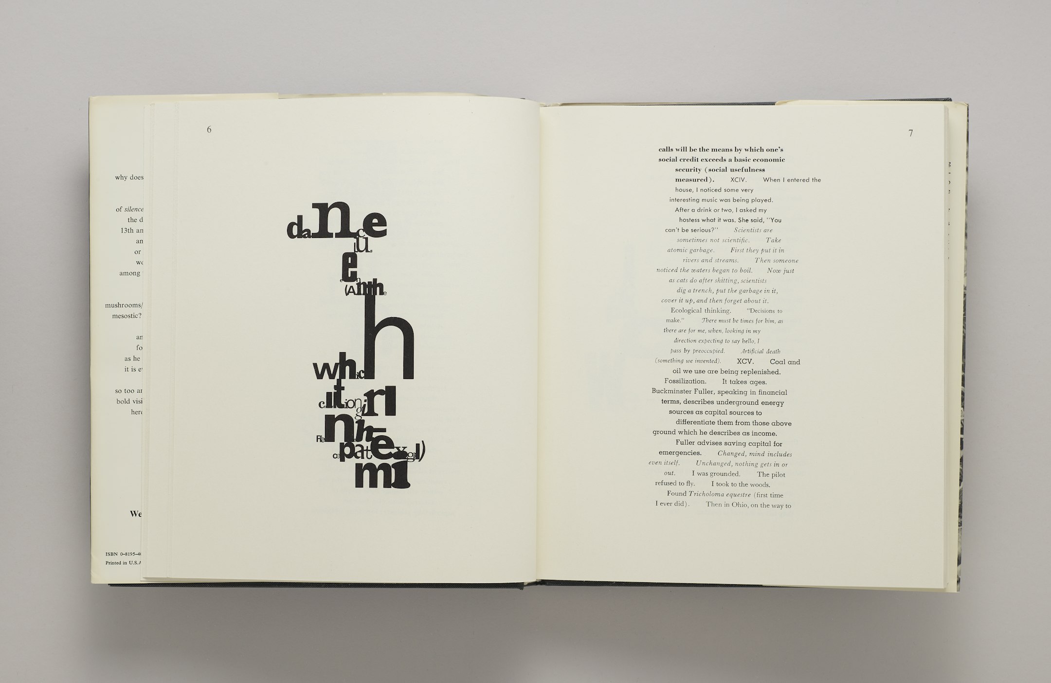
Many experiments in the past, both in the West and the East have used poetry as content for expressive typography. In Indian classical poetry, works of poets like Kālidāsā, Jayadevā, Mirābhai, Tulsidās and Andāl, to name a few, are highly charged with artistic imagination, providing the necessary substance for experiments in expressive typography. Classical literary works are characterised by their rasās or the emotional and aesthetic quality expressed through the piece. They remain deeply rooted in Indian historical context, yet allowing for varied artistic interpretations. Jha notes the essence of imagery in figurative poetry:
There cannot be any polarisation between meaning and word, content and form, because these dualities are apparent only by analytical dissection. In the actual poetic expression, they are indissolubly united.
The dichotomic tension and meta-modernism
One of the burning questions I have is drawing the line between legibility and illegibility, and how to balance the desire for experimentation with the need to create readable type for an audience. At Typoday 2019, Beth Salter’s described this as the “dichotomic tension” inherent in digital works of expressive typography. The historical and contemporary account presented by Salter acknowledges that this tension exists and has been a contentiously debated question in the field. Path-breaking explorations in the past have often been seen as foregoing the conventions of traditional typography in favour of personal expression.
At the heart of experimental typography are two key facets, rigour and experimentation, two seemingly binary opposites. One way to resolve this dissonance is to reconsider the term meta-modernism. Meta-modernism oscillates between the modern and the postmodern notions of typography. The meta-modernist approach to this question is to insist on the importance of experimentation first and set aside concerns about legibility, audiences and outcomes. One has to push the limits of experimentation before making decisive calls on the outcome.